Summary chip
Summary chips are compact components designed to quickly and concisely summarize data. They are often used to provide a condensed overview, summarize states, and allow for filtering of information in a visually appealing manner.
Usage
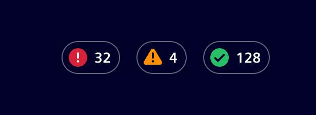
There are basically two main use cases for the summary chip component:
- State indication: To show values of different categories, such as
Override,Success,Issue,Not tested, etc. - Filtering: To filter datasets or information based on the specific categories.
When to use
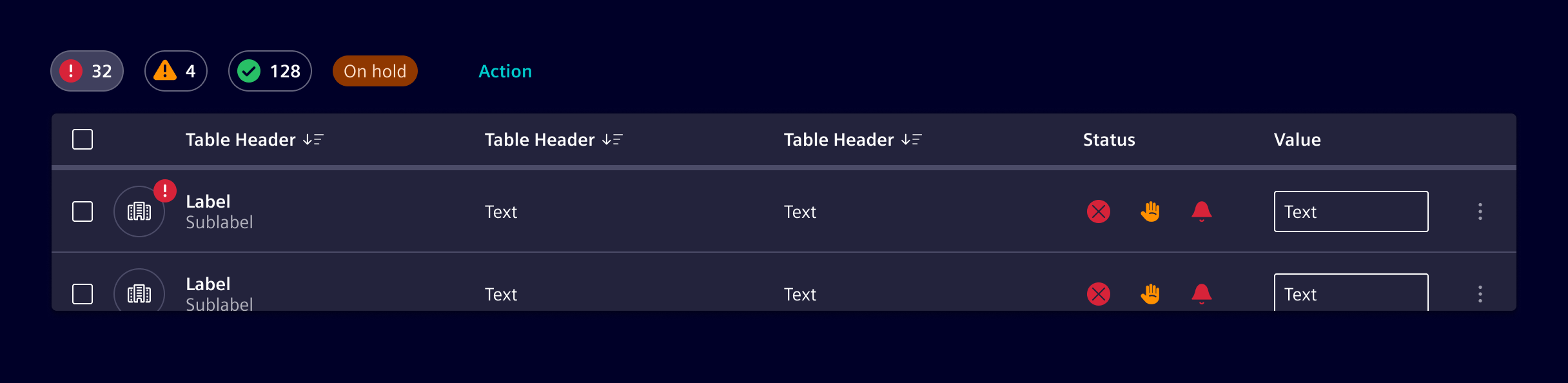
Arrange one or more Summary Chips in a horizontal layout above or near the related content.
Chips can be combined with other supporting elements, such as badges, buttons, or links, to enhance functionality.
Place them within a container that can use a background of None, Base-0, or Base-1, depending on the visual requirements.
Design
Elements
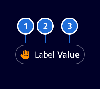
- Category icon or composite icon (optional), 2. Label (optional), 3. Value (optional)
The summary chip can hold an icon or a composite icon representing a state. The icon must be self-explanatory since there is no label.
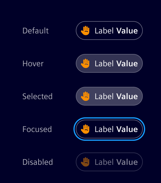
States
Variants
The component is very flexible, hence allowing the following variants:
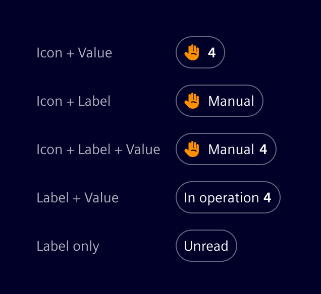
Code
SiSummaryChipComponent API Documentation
si-summary-chip
Input Properties
| Name | Type | Default | Description |
|---|---|---|---|
| color ¶ |
string |
Color class, see https://element.siemens.io/typography/#color-variants-classes . | |
| disabled ¶ |
boolean |
false |
Disabled state. |
| hideLabel ¶ |
boolean |
false |
Whether to hide the label. Only takes effect when both icon and value are provided. The label will still be used for screen-readers. |
| icon ¶ |
string |
Icon token, see https://element.siemens.io/icons/element . | |
label ¶ ¶ |
TranslatableString |
The label. | |
| selected ¶ |
boolean |
false |
Selected state, will change when clicked. |
| stackedColor ¶ |
string |
Color class, see https://element.siemens.io/fundamentals/icons/ . | |
| stackedIcon ¶ |
string |
Icon token, see https://element.siemens.io/fundamentals/icons/ . | |
| status ¶ |
ExtendedStatusType |
Status. Alternatively, use icon and color . | |
| value ¶ |
TranslatableString |
Value to display. |
Output Properties
| Name | Type | Description |
|---|---|---|
| selectedChange ¶ |
boolean |
Selected state, will change when clicked. |
Types Documentation
|
Represents a translatable string. This can either be a translation key, e.g.
ACTIONS.EDIT that
will be automatically translated when displayed on the UI or a pre-translated string, e.g. Edit .
Equivalent to a normal string in usage and functionality.
|
|---|
|
|
|---|
|
|
|---|
|
|
||||||||
|---|---|---|---|---|---|---|---|---|
|
Except where otherwise noted, content on this site is licensed under MIT License.