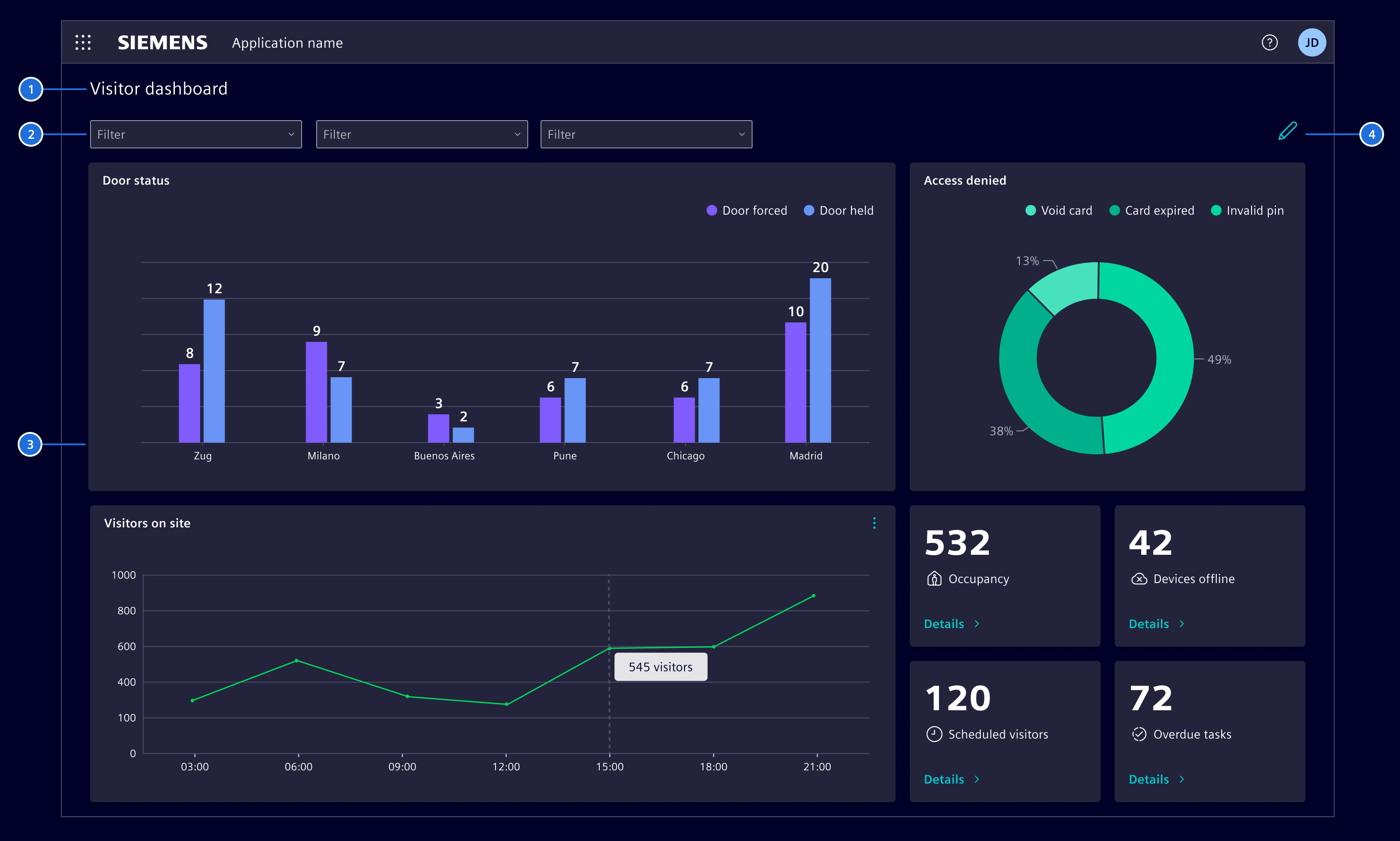
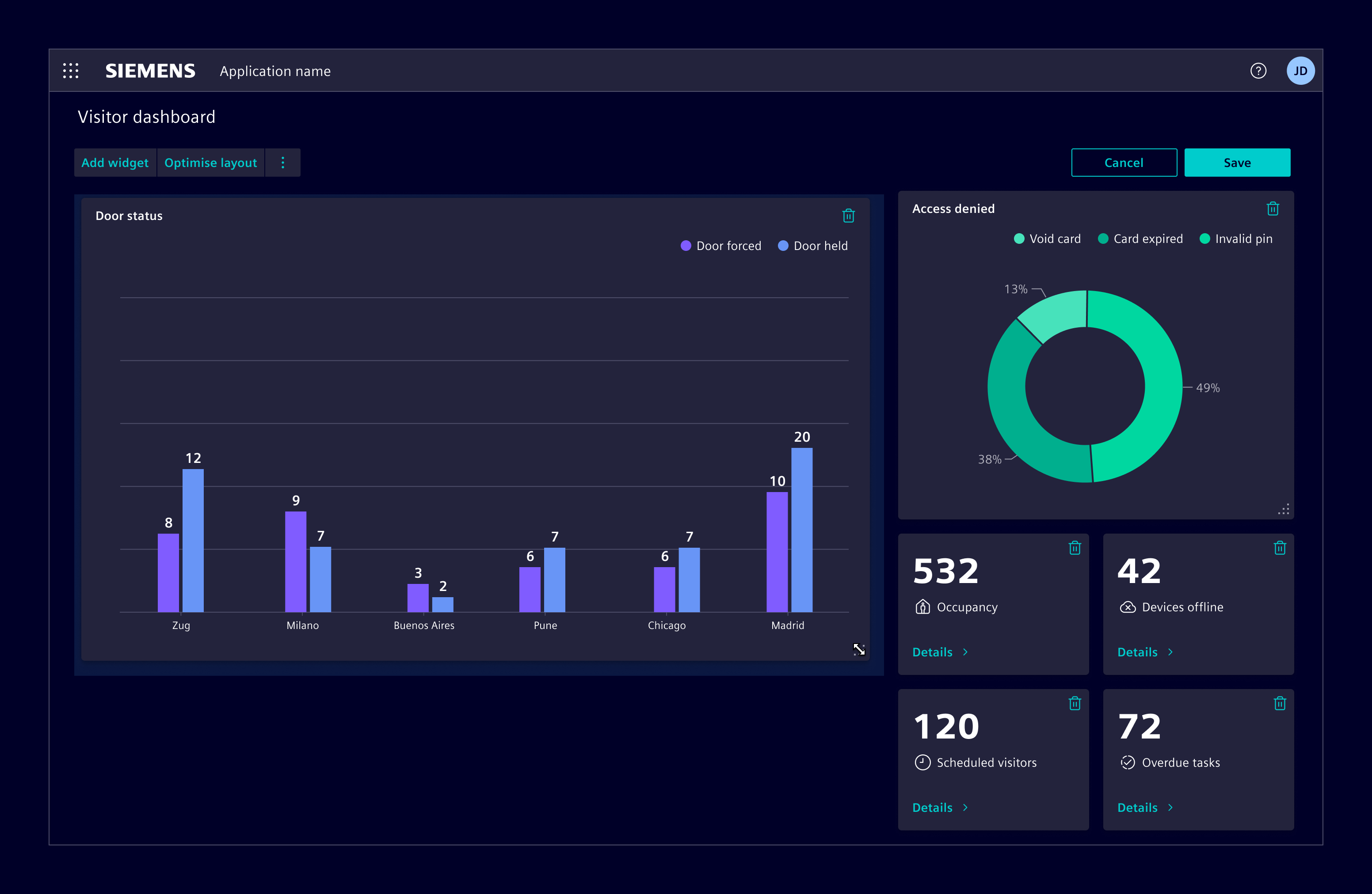
In default mode, the dashboard displays a pre-defined set of widgets,
providing users with a view of the data and insights based on their chosen
configuration.
Title (optional), 2. Dashboard options (optional), 3. Content area 4. Edit mode button
The dashboard options area on top of the widgets can be used for actions such
as filtering, which affect the whole dashboard.
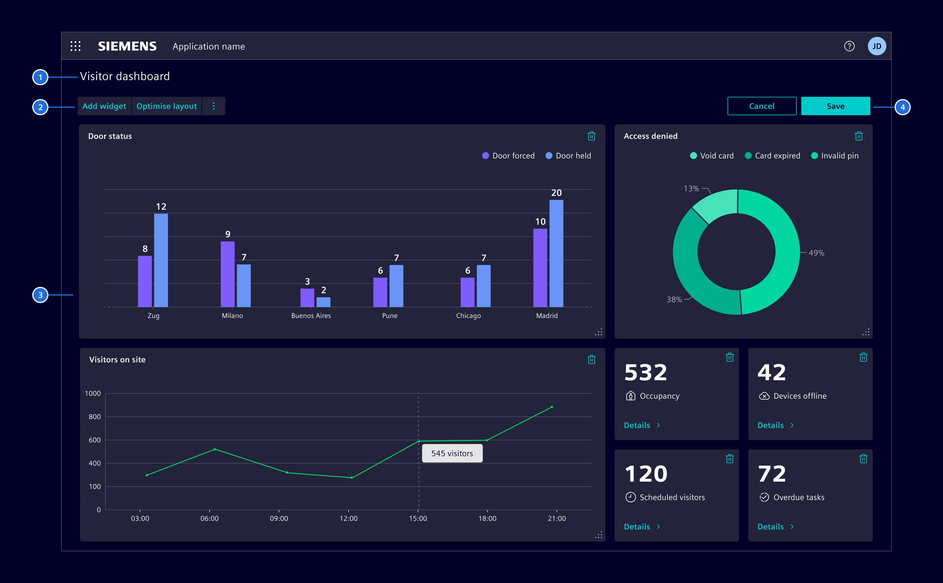
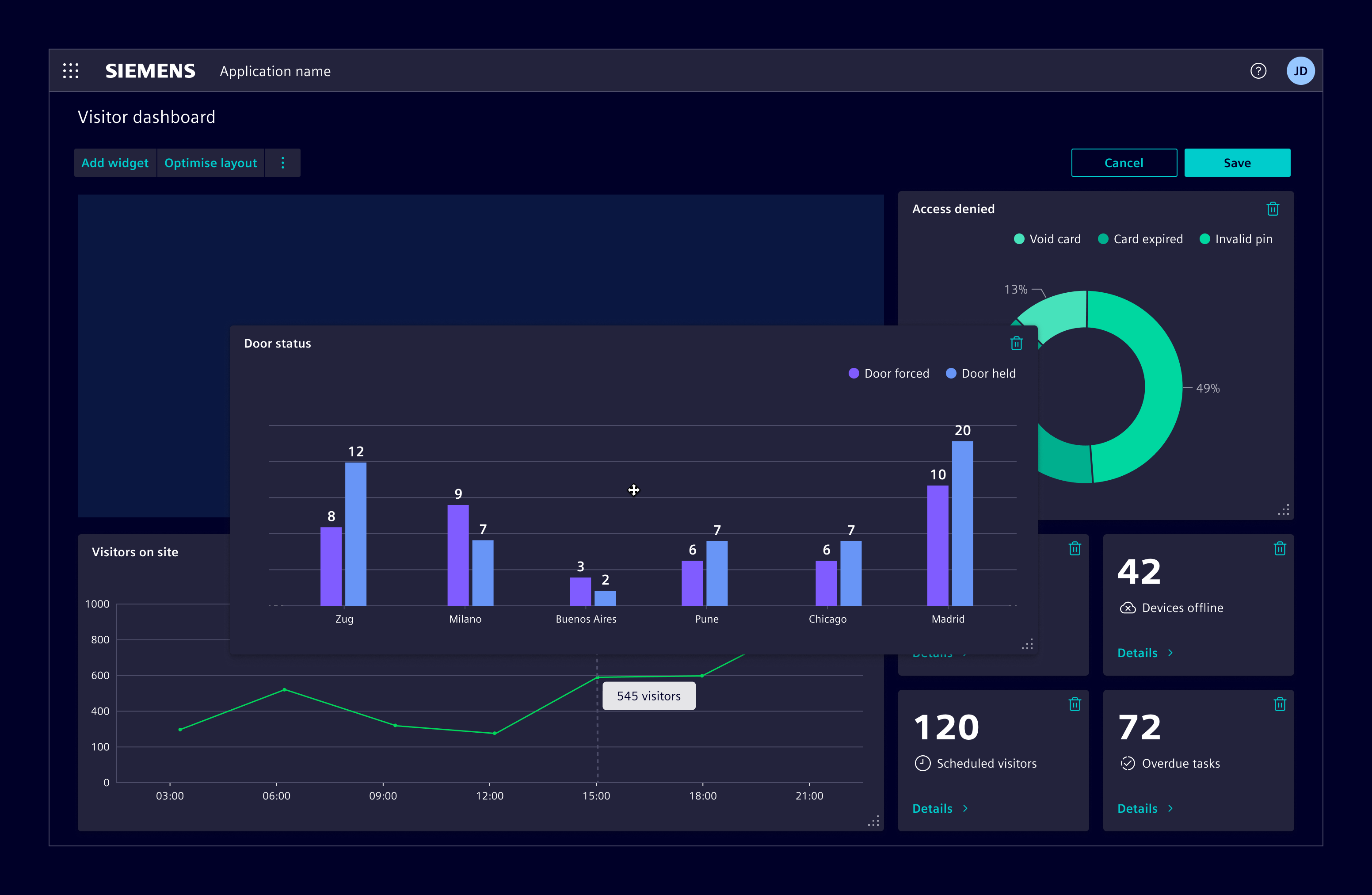
In edit mode, users can customize the dashboard to fit their specific needs.
The dashboard options area is replaced by editing options that allow users
to add widgets and perform other actions.
Title (optional), 2. Editing options (optional), 3. Content area, 4. Save and cancel button
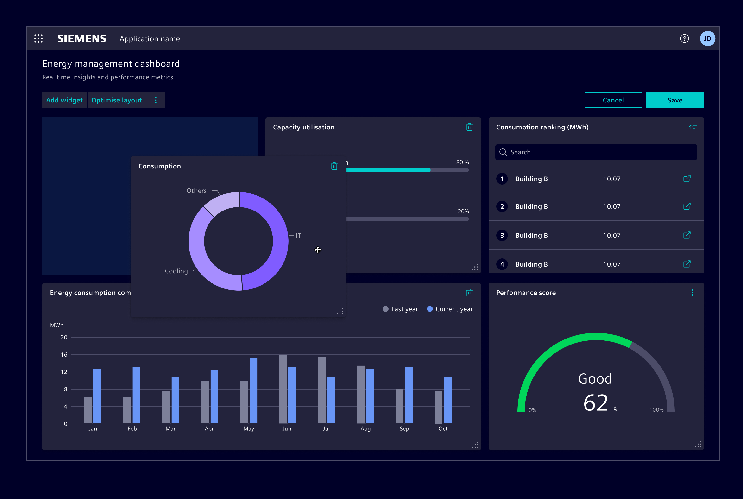
Users can use the resize handler at the bottom right corner and drag
horizontally to change the width, vertically to change the height, or diagonally
to change both dimensions. A light blue box appears to indicate the area a
widget will snap to, once the user releases the resize handle.
Users can select a widget within the content area and drag it to the desired
location. As with resizing, a light blue box appears to indicate where the
widget will be positioned upon letting it go.
The component implements a dashboard with adding, removing and resizing widgets.
It consists and connects a toolbar, a grid with widgets, and a widget catalog.
Emits the modification state of the grid. It is unmodified when the visible state is equal to the loaded state from the widget storage. When the user modifies the dashboard by e.g. while moving the widgets, the dashboard is marked as modified and emits true and when the user persists the change by saving, or reverts the state by canceling, the state is unmodified again and emits false .
The grid component is the actual component on which the widget instances are placed and visualized. You can think of
a headless dashboard, without a title, toolbar or edit buttons.
When the user clicks edit on a widget instance, an editor need to appear and the widget editor component need to be loaded. When the grid is used standalone, it takes care and opens a modal dialog and loads the configured widget editor component. When the grid is used in a container like the flexible dashboard, the container manages where the widget instance editor is displayed. In this case this options prevents the grid from showing the editor in the dialog, and emits on widgetInstanceEdit on clicking the widget edit action.
Provides the available widgets to the grid. When loading the widget configurations from the storage, we need to have the widget definition available to be able to create the widget instances on the grid.
Emits the modification state of the grid. It is unmodified when the visible state is equal to the loaded state from the widget storage. When the user modifies the dashboard by e.g. while moving the widgets, the dashboard is marked as modified and emits true and when the user persists the change by saving, or reverts the state by canceling, the state is unmodified again and emits false .
Widget storage api to provide the persistence layer of the widgets of a dashboard
(typically from a web service). The dashboard grid uses this API to load and save
the widget configurations. Applications using siemens-dashboard needs to implement
this abstract class and provide it in the module configuration.
Saves the given widget configuration. New widgets have id
generated through the SiWidgetIdProvider.generateWidgetId implementation
and if ids comes from backend then it is in the responsibility of the implementor to update
the ids of the new widgets with the ids returned from backend upon save. In addition,
the implementor needs to check if objects that have been available before are missing. These
widgets have been removed by the user. As a result of this method, the observables returned
by the load() method should emit the new widget config objects, before also returning them.
Returns An observable that emits the saved widget config objects with their ids.
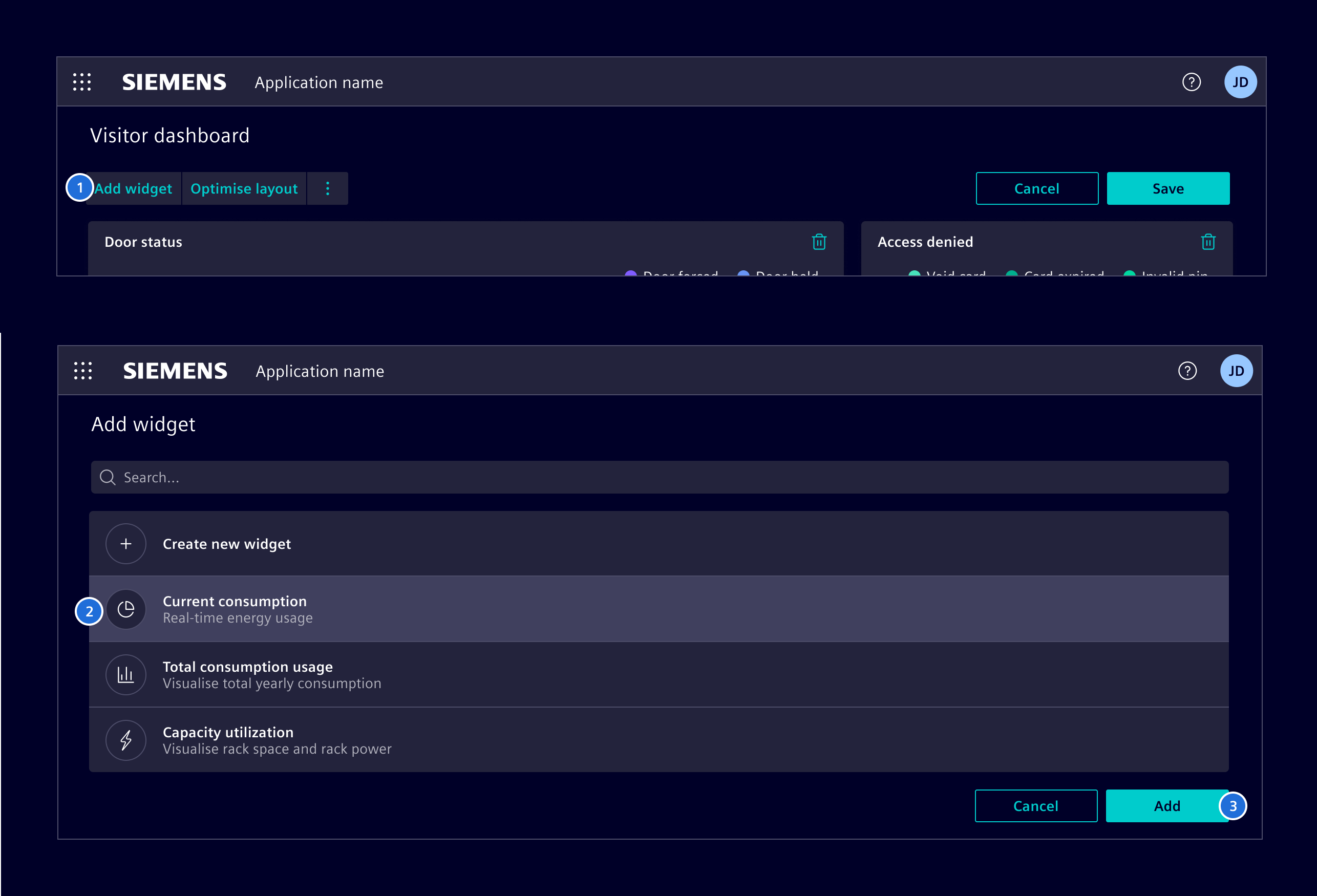
Default widget catalog implementation to show all available widgets that can be added
to a dashboard. It consists of a list view, that lists all available widgets and after
selection, a host in which the widget specific editor is loaded. Applications can either
stay with the default catalog or implement their own by extending this class.
Emits when the catalog is closed , either by canceling or by adding or saving a widget configuration. On cancel undefined is emitted, otherwise the related widget configuration is emitted.
Property to provide the available widgets to the catalog. The flexible dashboard creates the catalog by Angular's createComponent() method and sets the available widgets to this attribute.
SiWidgetInstanceEditorDialogComponent API Documentation
selector
si-widget-instance-editor-dialog
The Dialog component is utilized when editing a widget instance within a dashboard.
It dynamically loads and creates the associated widget editor and incorporates it
into its content. The dialog component is accountable for interacting with the dashboard
and offers options for saving changes or terminating the editing process.
The SiWidgetRendererComponent is a presentational (dumb) component that renders
a single widget instance from a WidgetConfig, without the surrounding dashboard
or grid infrastructure. It takes the exact Widget definition to render and
delegates the actual rendering to the widget host.
Use it to display an individual widget outside of a flexible dashboard, for example
in kiosk mode or within a custom layout such as a carousel. The component is a
self-contained widget cell that can be placed anywhere a single widget needs to be
shown.
It requires two inputs: the widgetConfig describing the widget instance to render
and the matching widget definition. The widget must match the config's widgetId.
<!-- Render a single widget instance --><si-widget-renderer[widgetConfig]="widgetConfig"[widget]="widget"/>
A presentational (dumb) component that renders a single widget instance from a
WidgetConfig using the provided Widget definition. It delegates
the actual rendering to the SiWidgetHostComponent .
Intended Usage
This component renders an individual widget outside of a dashboard or grid,
without requiring manual host wiring. It is a self-contained widget cell that
can be placed anywhere a single widget needs to be shown, for example in kiosk
mode or within a custom layout such as a carousel.
Example
<!-- Render a single widget instance --><si-widget-renderer[widgetConfig]="widgetConfig"[widget]="widget"/>
Represents a translatable string. This can either be a translation key, e.g. ACTIONS.EDIT that
will be automatically translated when displayed on the UI or a pre-translated string, e.g. Edit .
Equivalent to a normal string in usage and functionality.
Widgets describe the entries within the widget catalog and holds all
default configuration and factory functionality to instantiate a widget
instance, represented as WidgetConfig objects.
A WidgetConfig holds the configuration of a widget instance component that is visible on a dashboard.
It can be persisted and used to restore a dashboards state.
State to control the behavior of a widget instance editor wizard.
The wizard state is used to control the behavior of the dialog buttons
provided by the catalog and editor components.
An editor component for a widget instance need to implement this interface.
After initializing the instance editor component, with widget configuration
is set. Optionally, the component can emit changes during editing to control
e.g. the dialog behavior like disabling the save button.
Properties
The hosting component of the widget instance editor sets the configuration
after initialization. The editor component should use the configuration as
input and persist all relevant changes within the config. The hosting component
takes the config after adding of saving the widget instance and updates the
dashboard.
config: (WidgetConfig | Omit<WidgetConfig, "id"> | InputSignal<(WidgetConfig | Omit<WidgetConfig, "id">)>)
Factory configuration for loading widget components from a federated module.
Supports both Module Federation and Native Federation patterns for micro-frontend architectures.
Use this when the widget component is hosted in a separate, independently deployed application.
A widget instance editor component that shall support a multi-page
widget configuration can implement this interface. The wizard-like
page state WidgetInstanceEditorWizardState needs to be managed
by the editor itself and is used to control wizard dialog buttons
that are provided by the catalog and editor component.
Properties
The hosting component of the widget instance editor sets the configuration
after initialization. The editor component should use the configuration as
input and persist all relevant changes within the config. The hosting component
takes the config after adding of saving the widget instance and updates the
dashboard.
config: (WidgetConfig | Omit<WidgetConfig, "id"> | InputSignal<(WidgetConfig | Omit<WidgetConfig, "id">)>) from config
The current state of the multi-page widget instance editor. The state
is access after #next() or #previous() is invoked.
state: WidgetInstanceEditorWizardState
Is invoked from the next button. Display next page as consequence.
For web components, implementing next() requires adding an event listener
for the next event on the element.
next: () => void
Is invoked from the previous button. Display previous page as consequence.
For web components, implementing previous() requires adding an event listener
for the previous event on the element.
previous: () => void
The hosting component of the widget instance editor sets the configuration
after initialization. The editor component should use the configuration as
input and persist all relevant changes within the config. The hosting component
takes the config after adding of saving the widget instance and updates the
dashboard.
Callback for delaying dismiss with a progress indicator until the
returned Observable: Observable emits.
delayDismiss?: (result: "confirm") => Observable<"confirm"> from ActionDialogBase.delayDismiss
Optional icon that will be rendered before the label.
icon?: string from icon
Badge (always red) that is attached to the icon.
If value===true, an empty red dot will be rendered.
iconBadge?: (string | number | boolean) from iconBadge
ID that will be attached to the DOM node.
id?: string from id
Action that called when the item is triggered.
A function will be called, a string will be dispatched to the SiMenuActionService .
action: (string | (actionParam: any, source: this) => void)
Optional icon that will be rendered before the label.
icon?: string from icon
Badge (always red) that is attached to the icon.
If value===true, an empty red dot will be rendered.
iconBadge?: (string | number | boolean) from iconBadge
ID that will be attached to the DOM node.
id?: string from id
Optional icon that will be rendered before the label.
icon?: string from icon
Badge (always red) that is attached to the icon.
If value===true, an empty red dot will be rendered.
iconBadge?: (string | number | boolean) from iconBadge
ID that will be attached to the DOM node.
id?: string from id
Optional icon that will be rendered before the label.
icon?: string from icon
Badge (always red) that is attached to the icon.
If value===true, an empty red dot will be rendered.
iconBadge?: (string | number | boolean) from iconBadge
ID that will be attached to the DOM node.
id?: string from id
Action that called when the item is triggered.
A function will be called, a string will be dispatched to the SiMenuActionService .
action: (string | (actionParam: any, source: this) => void)
Optional icon that will be rendered before the label.
icon?: string from icon
Badge (always red) that is attached to the icon.
If value===true, an empty red dot will be rendered.
iconBadge?: (string | number | boolean) from iconBadge
ID that will be attached to the DOM node.
id?: string from id
Action that called when the item is triggered.
A function will be called, a string will be dispatched to the SiMenuActionService .
action: (string | (actionParam: any, source: this) => void)
Optional icon that will be rendered before the label.
icon?: string from icon
Badge (always red) that is attached to the icon.
If value===true, an empty red dot will be rendered.
iconBadge?: (string | number | boolean) from iconBadge
ID that will be attached to the DOM node.
id?: string from id
Use this to assign values to either @Input() or input() fields of the provided component.
If a template is used, the values are available in the template context.
inputValues?: Record<string, unknown>
A function that will be invoked when clicking on the menu item.
When passed as a string, use together with SiLinkActionService to receive events. This is
meant for repetitive things in lists/tables/etc.
action?: (string | (param: any) => any)
A boolean that lets the link know whether it is disabled or not.
disabled?: boolean
Defines a href URI that the menu item will be linked to. Will be used to set the href attribute
of the a element. Will only be used if link and function is not set.
href?: string
A boolean that lets the link know whether it is active or not. It is useful when action() is executed instead of link route.
isActive?: boolean
Defines the link of the menu item within the application using the angular router link concept.
Accepts an array of any as per [routerLink API definition] https://angular.dev/api/router/RouterLink .
link?: (string | any[])
The grid component is the actual component on which the widget instances are placed and visualized. You can think of
a headless dashboard, without a title, toolbar or edit buttons.
An optional, but recommended dashboard id that is used in persistence and passed
to the widget store for saving and loading data.
dashboardId: InputSignal<(string | undefined)> = ...
Sets the grid into editable mode, in which the widget instances can be moved,
resized, removed or new ones added.
editable: ModelSignal<boolean> = false
When the user clicks edit on a widget instance, an editor need to appear and the
widget editor component need to be loaded. When the grid is used standalone, it
takes care and opens a modal dialog and loads the configured widget editor component.
When the grid is used in a container like the flexible dashboard, the container manages
where the widget instance editor is displayed. In this case this options prevents the grid
from showing the editor in the dialog, and emits on widgetInstanceEdit on clicking the
widget edit action.
emitWidgetInstanceEditEvents: InputSignal<boolean> = false
Emits the modification state of the grid. It is unmodified when the visible state
is equal to the loaded state from the widget storage. When the user modifies the dashboard by
e.g. while moving the widgets, the dashboard is marked as modified and emits true and when the user
persists the change by saving, or reverts the state by canceling, the state is unmodified
again and emits false .
isModified: OutputEmitterRef<boolean> = ...
All widget instance configurations that are removed from the grid in edit mode.
These instances are persistently removed on save or re-added again on cancel.
markedForRemoval: WidgetConfig[] = []
Modified state that is emitted in the isModified output. Should only be
changed using the setModified method.
modified: boolean = false
All widget instance configs that are on the grid by loading from the widget
storage. Thus, these widget are persisted.
persistedWidgetInstances: WidgetConfig[] = []
Widget instance configs that are added to the grid in edit mode, but not
persisted yet, as the user did not confirm the modification by save.
transientWidgetInstances: WidgetConfig[] = []
Provides the available widgets to the grid. When loading the widget configurations from
the storage, we need to have the widget definition available to be able to create the widget
instances on the grid.
widgetCatalog: InputSignal<Widget[]> = []
A callback method that is invoked immediately after the
default change detector has checked data-bound properties
if at least one has changed, and before the view and content
children are checked.
A callback method that performs custom clean-up, invoked immediately
before a directive, pipe, or service instance is destroyed.
ngOnDestroy: () => void from OnDestroy.ngOnDestroy
A callback method that is invoked immediately after the
default change detector has checked the directive's
data-bound properties for the first time,
and before any of the view or content children have been checked.
It is invoked only once when the directive is instantiated.
ngOnInit: () => void from OnInit.ngOnInit
The service provides convenient methods to show common modal dialogs.
All return an observable, which emit the dialog results. After emitting,
the observables complete. Therefore, clients do not need to unsubscribe.
If the underlying translation library supports switching the language
and/or updating the translation texts, this observable will emit.
There is no initial emit.
get translationChange: Observable<void>
Methods
The language to be used as default.
Returns The code of the default language.
getDefaultLanguage: () => (string | null)
If supported by the underlying translation library, this method can be used to add a translation for a specific key.
It is intended to be used for adding the english default value.
It will be called whenever a key within element is resolved.
An implementation of this method must check that it does not override an existing translation.
Translates the key(s) by using the underlying translation library.
Returns Returns the translated key or an object with the translated keys.
Depending on the underlying translation library (sync/async) the result will
be wrapped in an Observable.
Parameters
A single translation key or an array of keys.
keys: T
Translates the key(s) by using the underlying translation library in an asynchronous manner.
It will emit each time the active language is changed.
Returns Returns the translated key or an object with the translated keys wrapped in an Observable.
Parameters
A single translation key or an array of keys.
keys: T
Translates the key(s) by using the underlying translation library in a synchronous manner.
Warning: The caller of this function needs to make sure the translation file(s) are already loaded.
It is generally not recommended to use this function unless you know exactly what you are doing.
Returns Returns the translated key or an object with the translated keys.
Parameters
A single translation key or an array of keys.
keys: T