Typography
Note: The Siemens font is part of the official Siemens branding and must not be used in non-Siemens applications. Element uses a default font that is not associated with Siemens branding. Please note that the default theme is currently undocumented.
Typographic hierarchy is established through text size and color.
Usage
For a cohesive typography experience, Element's type scale uses the Siemens Sans typeface. Hierarchy is communicated through differences in font weight (Roman and Semi bold) and size.
Best practices
- Respect the typographic scale order for consistent and hierarchical design.
- Consider the purpose and context of the text when selecting a type style. Headings, subheadings, and body text each serve distinct functions and should be chosen accordingly.
- Combine font weight, size, and color to establish hierarchy, utilizing lighter colors or smaller font sizes to de-emphasize secondary content.
- Avoid style changes like bold and italic in the middle of a paragraph.
Design
Element’s typography is divided into body, headings, display, and code styles.
Body
Body text is used for the main content, often following a heading or as part of UI components.
- Use
bodyfor most components and labels. - Use
body-paragraphfor longer text blocks. - Use
body-lgfor larger and more prominent text. - Use
body-smfor small, supportive text like annotations or metadata.
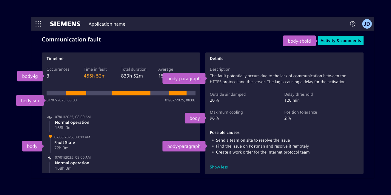
| Style | Font size | Line height | Font weight |
|---|---|---|---|
body-lg | 16 px | 20 px | 400 / Roman |
body | 14 px | 16 px | 400 / Roman |
body-paragraph | 14 px | 20 px | 400 / Roman |
body-sm | 12 px | 16 px | 400 / Roman |
All body styles are also available in semi bold and italic. Semi bold is used to add emphasis or draw attention to key information, and is also applied in specific UI elements, such as button labels, or highlighted values in tables and lists.
Italic is used sparingly, for cases like technical terms.
Headings
Headings communicate the structure and visual hierarchy of content on the page. They are defined semantically from h1 to h6.
- Use
h1for the largest headings. - Use
h2for main page headings. - Use
h3for section headings. - Use
h4for secondary section titles. - Use
h5for smaller content blocks such as cards or tertiary titles. - Use
h5-boldto emphasize smaller headings, such as unread notification titles. - Use
h6for the smallest heading level.
| Style | Font size | Line height | Font weight |
|---|---|---|---|
h1 | 28 px | 36 px | 600 / Semi Bold |
h2 | 24 px | 32 px | 600 / Semi Bold |
h3 | 20 px | 24 px | 600 / Semi Bold |
h4 | 16 px | 20 px | 600 / Semi Bold |
h5 | 14 px | 20 px | 600 / Semi Bold |
h5-bold | 14 px | 20 px | 700 / Bold |
h6 | 12 px | 16 px | 600 / Semi Bold |
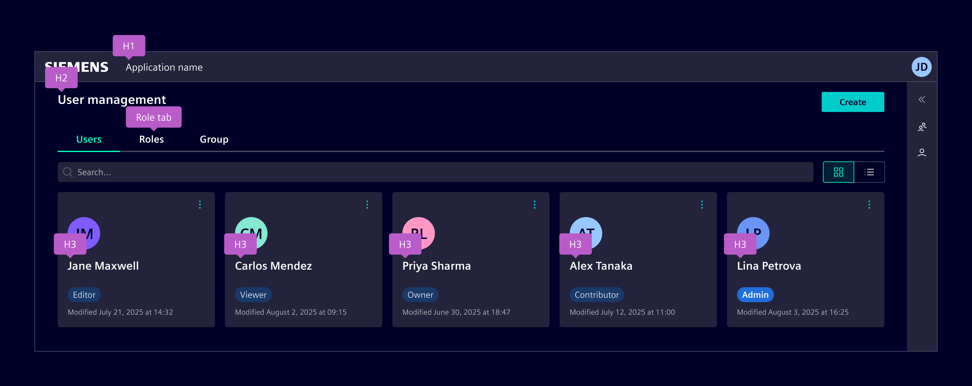
In order to adhere to accessibility best practices, each page should be structured according to the semantic hierarchy h1, h2, ... h6, starting from h1 and maintaining a logical order without skipping levels.
Web browsers, plug-ins, and assistive technologies rely on this structure to provide in-page navigation. When visual requirements do not align with the semantic hierarchy, the appropriate HTML elements (h1, h2, ... h6) should still be used, with the desired visual style applied through CSS classes.
When the visual style of h1 is too prominent for typical in-page headings, such as the page header, the h2 style is used instead for visual balance.
In this pattern, the h1 tag is assigned to the application name in the application header. This preserves both visual hierarchy and correct semantic structure for assistive technologies.
Links
Display
Display styles are used for high-impact content, such as hero sections, widgets, or dashboards. They should be used sparingly to maintain clarity.
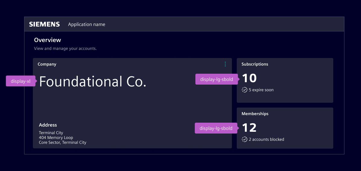
| Style | Font size | Line height | Font weight |
|---|---|---|---|
display-xxl | 58 px | 72 px | 400 / Roman |
display-xl | 48 px | 64 px | 400 / Roman |
display-lg | 40 px | 52 px | 400 / Roman |
display | 32 px | 40 px | 400 / Roman |
All display styles are also available in semi bold.
Code
Code styles are used for technical content such as code samples, inline code, and other monospaced text. Use them when you need to present commands, snippets, file names, or other technical values.
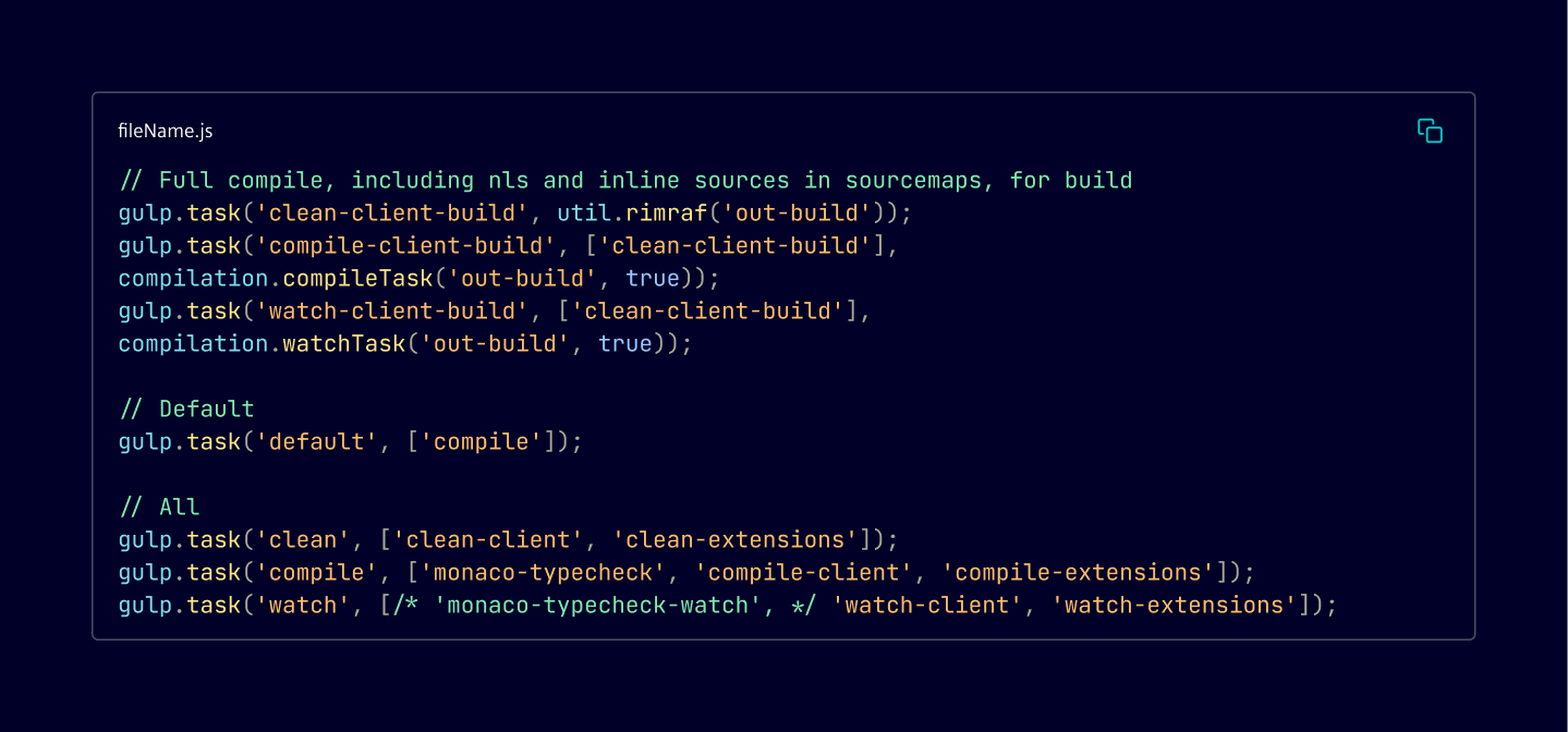
| Style | Font size | Line height | Font weight |
|---|---|---|---|
code-lg | 16 px | 20 px | 400 / Regular |
code | 14 px | 20 px | 400 / Regular |
code-sm | 12 px | 16 px | 400 / Regular |
Using the bounding box
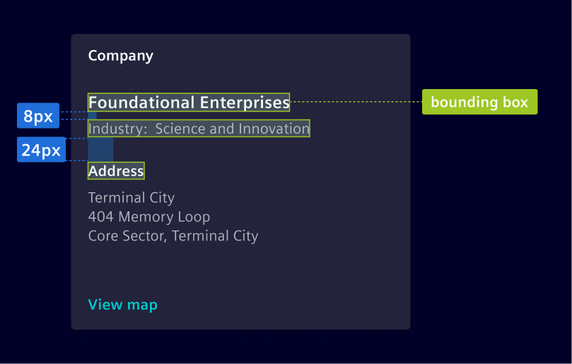
The vertical height of the text, known as the bounding box, is determined by the line-height. The value of the line-height is critical to make sure text aligns to the 8px grid.
Use the height of the bounding box together with top and bottom margin to determine spacing.
Line length
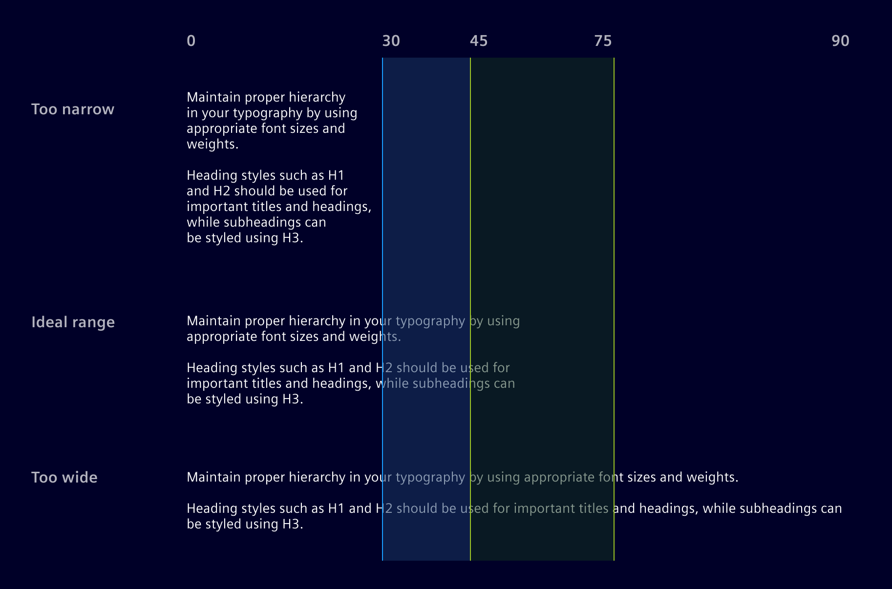
Wide lines of text are harder to read; aim for 45-75 characters per line on desktop, and 30-45 on mobile for optimal readability.
Color usage
Color is used in text to communicate information to the user. Color variants have meaning and are used to call attention to an action. The color of text must follow one of the predefined color variants and must not use any of the other defined colors.
See the Text Colors chapter.
Code
Most scenarios allow you to use the HTML semantic element(s) (e.g. h1, p) directly, all the required styles are set by default.
In case you can't use the HTML semantic (e.g. apply a text style to a non associated HTML tag) or you have to use a type style without matching semantic, you can use the .si- text classes.
Headings
Heading elements (<h1> through <h6>) are styled by default. For cases where you need heading-style typography but must use a different HTML element for semantic reasons, corresponding CSS classes are available.
<div class="si-h1">.si-h1 heading</div>
<div class="si-h2">.si-h2 heading</div>
<div class="si-h3">.si-h3 heading</div>
<div class="si-h4">.si-h4 heading</div>
<div class="si-h5">.si-h5 heading</div>
<div class="si-h5-bold">.si-h5-bold heading</div>
<div class="si-h6">.si-h6 heading</div>
Body styles classes
Body styles can be applied using classes prefixed with .si-body. Each style also has a semi bold variant with the -sbold suffix.
Use semantic elements such as <strong> and <em> when the emphasis has meaning. Use the .fst-italic utility when text only needs to be visually italicized.
Display styles classes
Apply display typography using CSS classes prefixed with .si-display-. These classes mirror the display typography scale defined in the design system and can be applied to any element. Semi bold variants use the -sbold suffix.
Code styles classes
Use the code style classes for technical values that require the monospaced typeface. Prefer semantic <code> or <pre> elements when presenting code.
Lead
Use the .lead class to make a paragraph visually prominent with larger text. This is typically used for introductory paragraphs or to emphasize key content at the beginning of a section.
<p class="lead">
  Vivamus sagittis lacus vel augue laoreet rutrum faucibus dolor auctor. Duis mollis, est non
  commodo luctus.
</p>
Inline text elements
Use these tags for semantic purposes:
| Semantic element | Alternative style | Description |
|---|---|---|
<mark> | .mark | Represents text which is marked or highlighted for reference or notation purposes. |
<del> | Represents a range of text that has been deleted from a document. | |
<ins> | Represents a range of text that has been added to a document. | |
<s> | .text-decoration-line-through | Represents elements that are no longer relevant or no longer accurate. |
<u> | .text-decoration-underline | Represents a span of inline text which should be rendered in a way that indicates that it has a non-textual annotation. |
<small> | .small | Represents side-comments and small print, like copyright and legal text. |
<strong> | .fw-bold | Represents a bold text. |
<em> | .fst-italic | Represents text rendered as italicized text. |
While not shown above, feel free to use <b> and <i> in HTML5. <b> is meant to highlight words or phrases without conveying additional importance, while <i> is mostly for voice, technical terms, etc.
<p>You can use the mark tag to <mark>highlight</mark> text.</p>
<p><del>This line of text is meant to be treated as deleted text.</del></p>
<p><s>This line of text is meant to be treated as no longer accurate.</s></p>
<p><ins>This line of text is meant to be treated as an addition to the document.</ins></p>
<p><u>This line of text will render as underlined.</u></p>
<p><small>This line of text is meant to be treated as fine print.</small></p>
<p><strong>This line is rendered as bold text.</strong></p>
<p><em>This line is rendered as italicized text.</em></p>
Text utilities
Change text alignment, colors, decoration, line-height, style, transform and weight with our text utilities and text color classes.
Typography specification
All font-sizes, line-heights and font-weights are specified as SASS variables, which can be used if required. The variables come in the form of $si-font-size-[name], $si-line-height-[name], $si-font-weight-[name] and are defined in _typography.scss.
@use '@siemens/element-theme/src/styles/variables';

font-size: variables.$si-font-size-h1;
line-height: variables.$si-line-height-h1;
font-weight: variables.$si-font-weight-h1;
We use the specifications for defining the style CSS classes and for configuring Element's typography system.
Except where otherwise noted, content on this site is licensed under MIT License.