List
Lists organize related content into rows that are easy to scan.
Usage
Lists are designed to be flexible and can be used with different styles depending on the context. They can be read-only or support interactions.
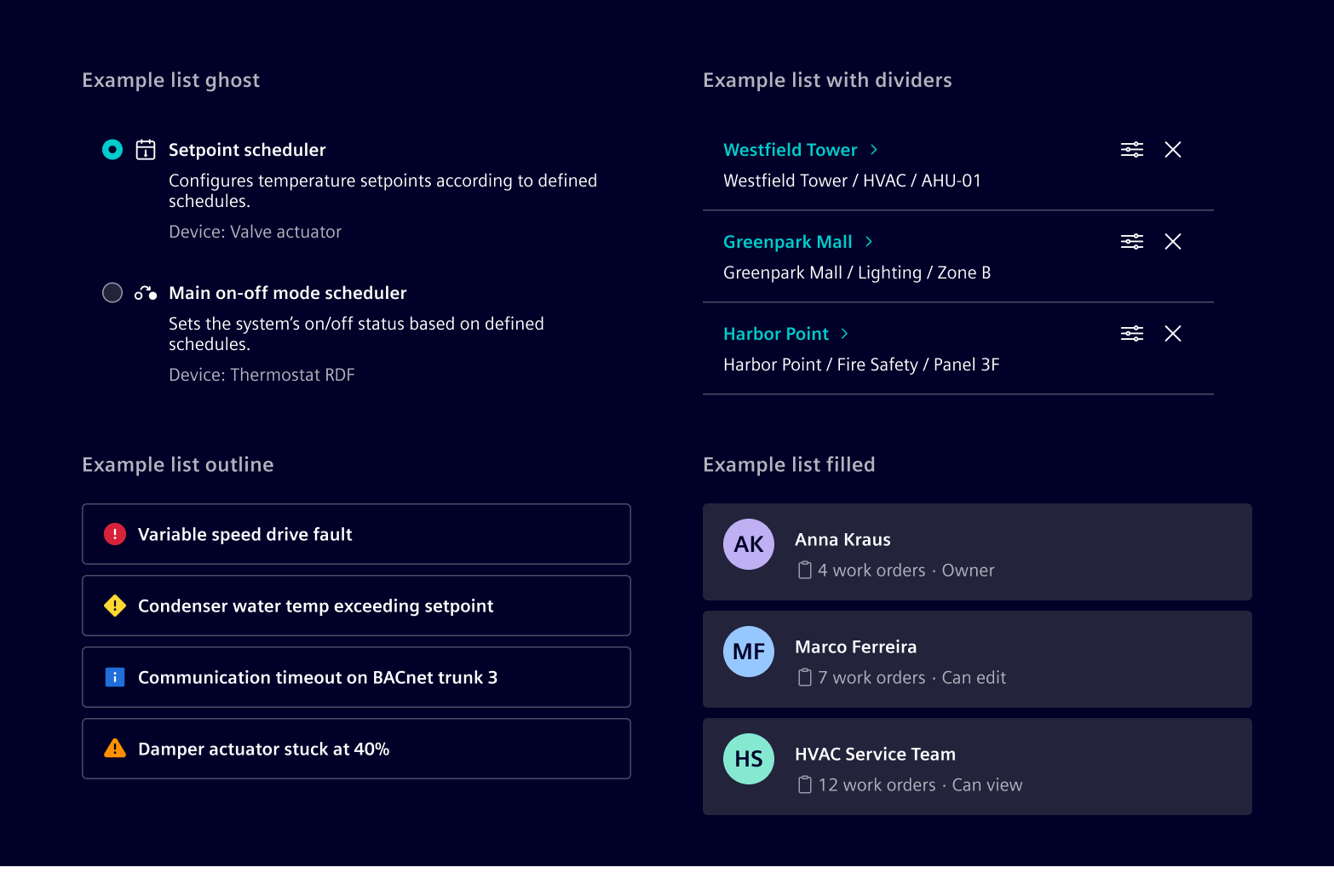
- Use a ghost list when the items should blend into the surrounding content and stay lightweight.
- Use a divider list when the items need separation but the list should still feel quiet and compact.
- Use a filled list when the list should stand out as a distinct section or card.
- Use an outline list when you want a clear container around the items without the stronger weight of a filled surface.
When to use
- When content needs to be shown as a repeatable, scannable row.
Best practices
- For complex data, use a table instead of a list.
- Keep structure consistent across all list items in the same list.
Design
Anatomy
List items are flexible building blocks that can support differentcontent types. The following example shows the most common layout.
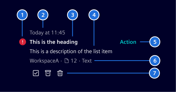
1. Indicator, 2. Timestamp, 3. Heading, 4. Description, 5. Primary action, 6. Metadata, 7. Quick actions
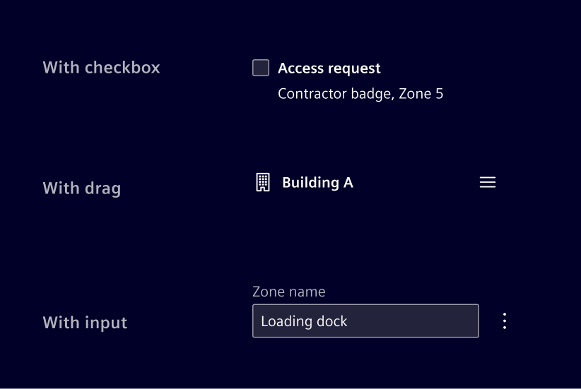
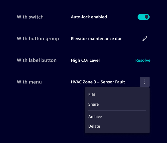
The anatomy above is a default example, but every slot can be swapped for a different control depending on the interaction the list needs to support. For example:
- Add checkboxes to support multi-select and bulk actions, or radio buttons for single-select.
- Add a drag handle to support manual reordering.
- Replace the heading text with an input to support inline editing.
Indicator
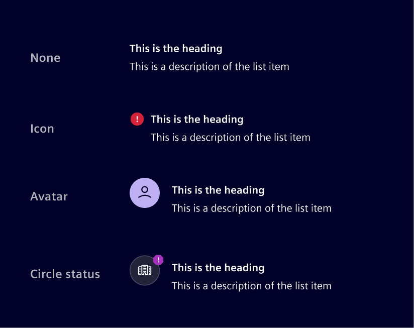
The indicator can support icons, circle status, or an avatar, depending on the content needs.
Actions
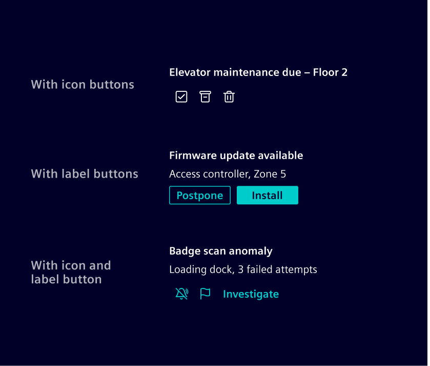
The list item supports two distinct action slots:
The primary action is most directly tied to the item's purpose. Works best as a single action, though it can hold more.
Quick actions are usually for operations performed on the item itself, such as pinning, archiving, sharing, or deleting. Works best when several need to be exposed at once.
Use a menu when there are more than three or four.
Metadata
It is typically displayed as text-based informational attributes. Icons may be added when they improve recognition. Badges can be used for explicit states or applied labels that should stand out visually.
The metadata does not include an intrinsic overflow behavior. How overflow is handled should change according to the layout constraints and information priorities.

Code
Example
Action list items
If the entire item is clickable, wrap the content inside a <button> or <a> element and apply the .list-item-action helper class for hover and focus styling. Use <a> when the action navigates to another page or resource, and <button> when it triggers an in-page action.
The item should be placed inside a <ul> + <li> structure to preserve list semantics.
Use aria-labelledby and aria-describedby on the interactive element to provide a concise accessible name (the title) and description, instead of exposing all inner text as the accessible name.
Metadata
Use .list-item-metadata to display supplementary contextual information below the description, such as workspace names, contributor counts, document links, or status badges. Items within the metadata row can be separated with .list-item-metadata-divider, which renders a small dot separator.
Unread state
Use the .unread class on .list-item-title to indicate unread items with a bold title and a dot indicator.
Except where otherwise noted, content on this site is licensed under MIT License.