Tooltip
Tooltips provide concise supplementary information when users hover over or focus on a UI element, typically buttons or icons.
Usage
Tooltips briefly appear over other content to provide additional context. They are triggered by hover or focus, making them particularly useful for desktop interactions.
Since tooltips are temporary and generally not accessible on touch devices, they should not contain critical or primary information.
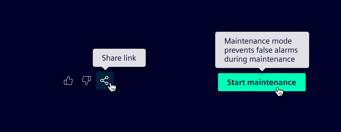
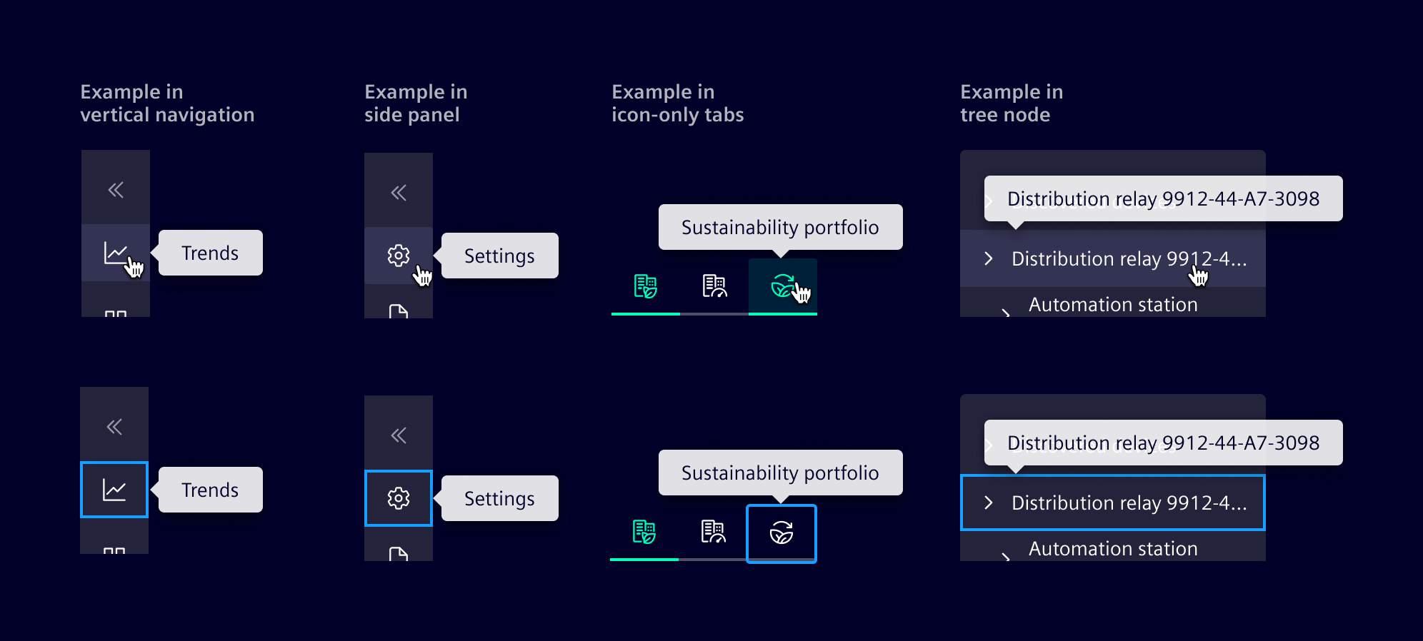
Tooltips are applied to controls that rely solely on an icon, such as icon buttons, icon-only tabs, application header and collapsed versions of vertical navigation and the side panel.
They may also reveal truncated text only when the element is focusable, for example a tree node.
When to use
- To clarify an element’s function or provide extra context for icons or buttons.
- For supplementary, non-essential information only.
Best practices
- Keep text brief.
- Do not include interactive elements.
- Use sparingly to reduce visual noise.
- Apply tooltips only to interactive, keyboard-focusable elements.
- Never add tooltips on disabled elements.
- When implementing tooltips on touch devices, ensure they appear on tap and that this interaction does not conflict with other functionalities.
- Always use the tooltip component, not the browser’s native tooltip.
- Use a 500ms show delay and allow dismissal on pointer leave, focus loss or pressing Escape.
Design
Elements
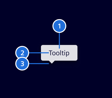
- Container, 2. Text content, 3. Tip
Placement
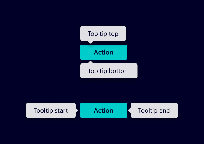
Four position options are available: top, end, bottom and start. Besides that, auto option may be used to detect a position that fits the component on the screen.
Alternatives to tooltips
Tooltips are temporary, implicit interactions that can interrupt the user’s flow. Because of these limitations, tooltips should be considered a last resort. Consider these strategies instead:
Reevaluate the need for tooltips
Consider whether the tooltip is actually needed. Avoid using them to repeat information that users can easily access.
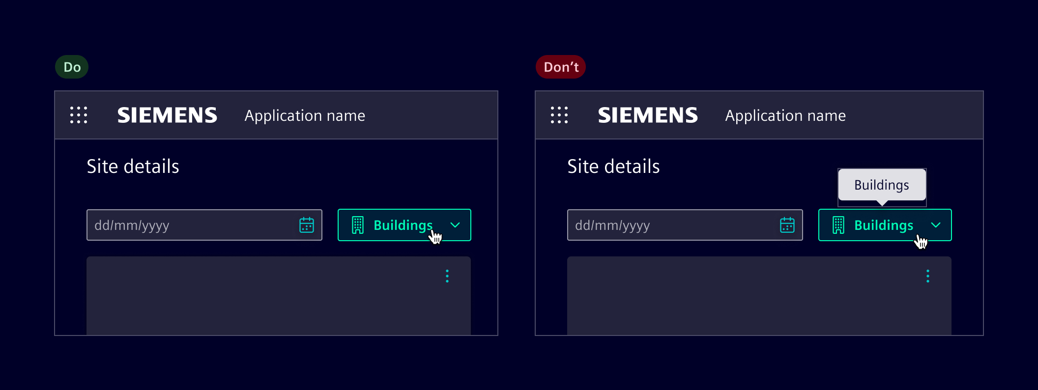
The right time and place
Think about where and when information will be most useful to users. Place key details directly on the interface in a clear, accessible spot, ensuring information is available at the right moment.
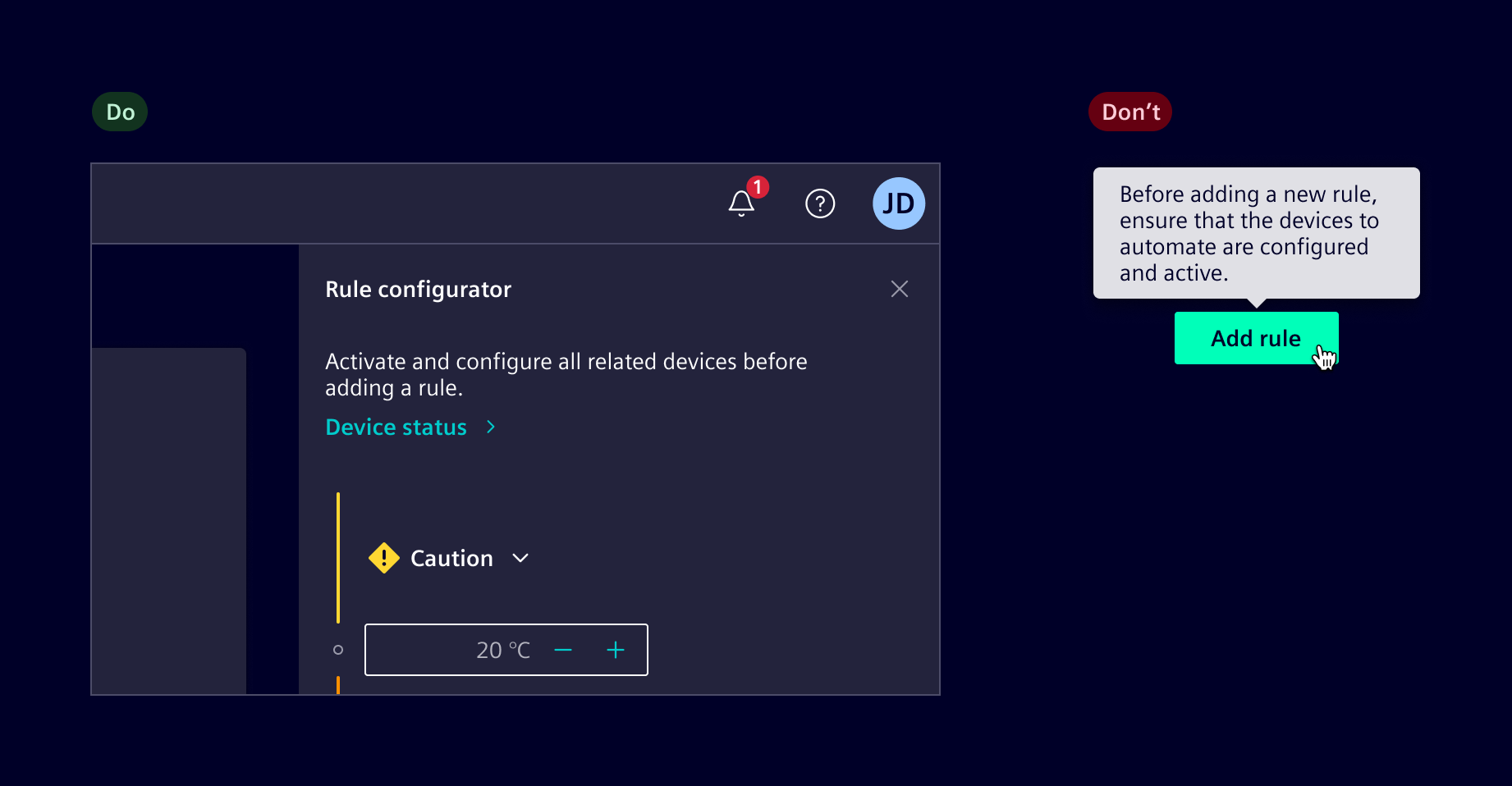
Use disclosures
Leverage expandable elements like dropdowns, accordions, or show/hide buttons to reveal additional information as needed, providing deeper context only when required.
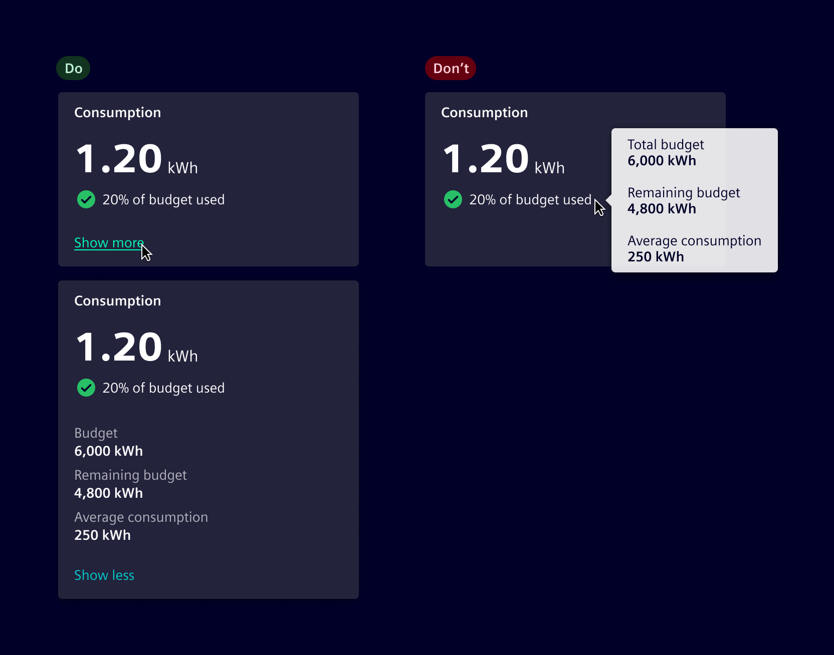
Use intuitive icons and labels
Tooltips should only replace labels for universally understood icons (e.g., edit, share). For complex or less intuitive icons, always display labels. If space is limited, ensure the legend is accessible elsewhere for users to understand the meaning.
Use popovers
For information that needs detailed explanation, use popovers, which are triggered explicitly and can hold more content.
| Component | Tooltip | Popover |
|---|---|---|
| Purpose | Provides supplementary, non-essential information. | Displays contextual information or interactive elements. |
| Interaction | Appears on hover or keyboard focus. | Opens on selection. |
| Dismissal | Dismisses on pointer leave, focus loss or pressing Escape. | Requires user interaction to close. |
| Interactivity | Non-interactive, only displays text. | Can contain buttons, links, and inputs. |
Code
Element supports several ways to show tooltips depending on the use case, but all share the following constraints:
- Display Triggers: Tooltips appear on element hover or keyboard focus.
- Dismissal: Press Escape to dismiss a visible tooltip, even while its trigger remains hovered or focused.
- No Interactive Content: Interactive elements (links, buttons, inputs) are not permitted inside a tooltip.
- Need Interactivity? Use a popover component instead of a tooltip.
Standard tooltip
Use the siTooltip directive when you need to show supplementary information. It must be on an interactive element like a button or link. Otherwise, it cannot be reached by keyboard user. It is using aria-describe to expose its content to screen reader.
Tooltip for text overflow
Use the siTooltipOverflow directive to display an element's full text content in a tooltip only when the text is visually truncated. The directive uses the host element’s text as the tooltip content, so no separate tooltip text is needed.
Automatic text truncation
The directive automatically applies the text-truncate class to the host element. You do not need to add this class manually.
Apply the directive to an interactive, keyboard-focusable element with a constrained width so its text can overflow.
SiTooltipDirective API Documentation
[siTooltip]Input Properties
| Name | Type | Default | Description |
|---|---|---|---|
| isDisabled ¶ | boolean | false | Allows the tooltip to be disabled |
| placement ¶ | ("auto" | "end" | "start" | "top" | "bottom") | 'auto' | The placement of the tooltip. One of 'top', 'start', end', 'bottom' |
| siTooltip ¶ | (TemplateRef<any> | TranslatableString) | '' | The tooltip text to be displayed |
| tooltipContext ¶ | unknown | The context for the attached template | |
| tooltipScrollStrategy ¶ | ScrollStrategy | defaultConnectedOverlayScrollStrategy() | CDK scroll strategy used for the tooltip overlay. |
Types Documentation
| Represents a translatable string. This can either be a translation key, e.g. ACTIONS.EDIT that will be automatically translated when displayed on the UI or a pre-translated string, e.g. Edit . Equivalent to a normal string in usage and functionality. |
|---|
Except where otherwise noted, content on this site is licensed under MIT License.