Source chips
The source chip allows users to inspect the origins of generated or referenced content.
Usage
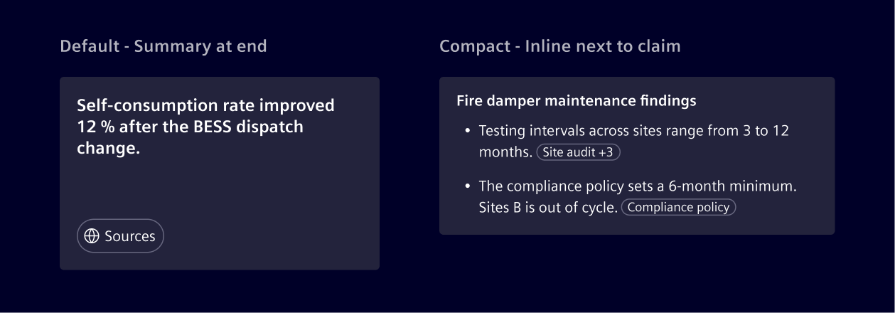
Use source chips to keep a response transparent about its references. Selecting a chip opens a popover with the source entry and a short excerpt.
- Use the default source chip when one source supports the whole response. It appears as a summary chip at the end.
- Use the compact source chip when a claim needs a source next to it. It appears inline with the text it supports. Use a
+ncounter when several sources support the same claim.
When to use
- In AI answers, research summaries, or any content grounded in documents or external data.
Design
Anatomy
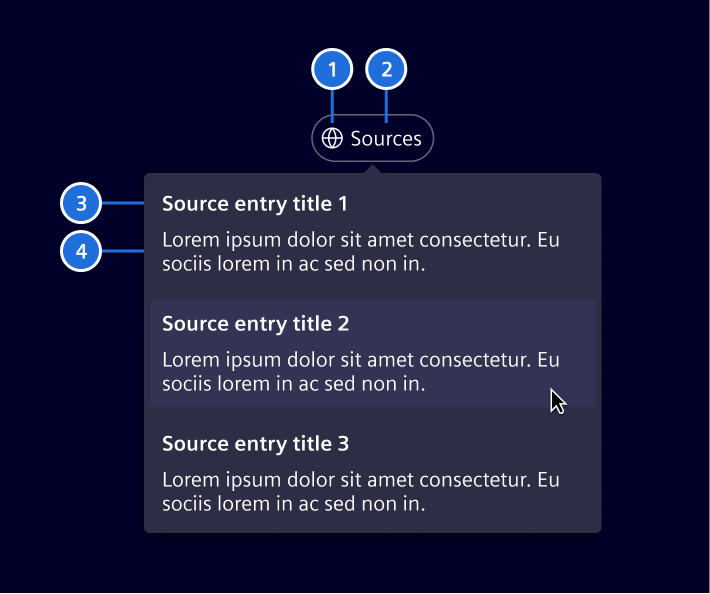
- Source label: Shows the source title for a single source, or
Sourceswhen the chip groups multiple sources. - Icon (optional): Marks the source as a web link. Include it when the source is external.
- Source entry title: The title shown for each source in the popover list.
- Relevant excerpt: Short snippet showing the exact passage the AI used.
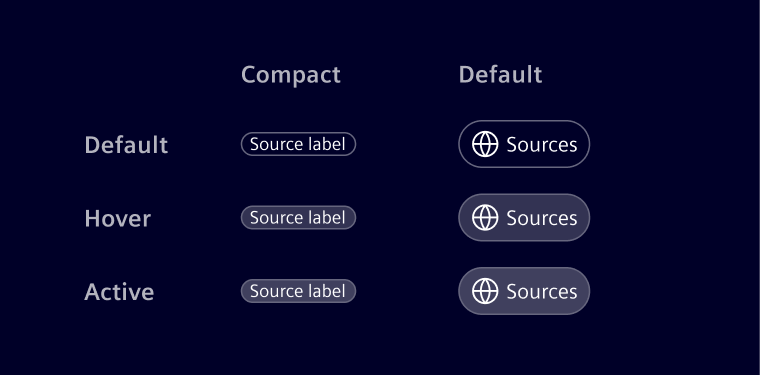
States
Code
Provide the sources through the sources input and handle sourceClicked to open the selected source or show it in the application.
import { Component } from '@angular/core';
import { SiSourceChipComponent, type SourceReference } from '@siemens/element-ng/source-chip';

@Component({
  imports: [SiSourceChipComponent],
  template: `<si-source-chip compact [sources]="sources" (sourceClicked)="openSource($event)" />`
})
export class SourceChipExampleComponent {
  protected readonly sources: SourceReference[] = [
    {
      name: 'Annual Report 2025',
      url: 'https://example.com/annual-report',
      quote: 'Revenue increased by 12% in 2025.'
    }
  ];

  protected openSource(source: SourceReference): void {
    window.open(source.url, '_blank', 'noopener');
  }
}
Use showLabel to always display Sources instead of a source name, and showIcon to display the source icon. Set disabled when source details must not be available.
SiSourceChipComponent API Documentation
selector
si-source-chipInput Properties
| Name | Type | Default | Description |
|---|---|---|---|
| compact ¶ | boolean | false | Compact mode for inline use. |
| disabled ¶ | boolean | false | Disabled state. |
| showIcon ¶ | boolean | false | Wether to show the glob icon. |
| showLabel ¶ | boolean | false | Wether to show a 'sources' label |
sources ¶ ¶ | SourceReference[] | The sources. |
Output Properties
| Name | Type | Description |
|---|---|---|
| sourceClicked ¶ | SourceReference | Emitted when a source has been clicked. |
Types Documentation
| Definition of a single source | |||||
|---|---|---|---|---|---|
|
Property Optional source description. |
|---|
Except where otherwise noted, content on this site is licensed under MIT License.