Dropdowns
Dropdowns are toggleable, contextual overlays for displaying actions related to the content.
Usage
They consist of a dropdown toggle and an overlay containing the actions. The overlay is shown after clicking the dropdown toggle. Dropdown are available with text only or with text and icon.
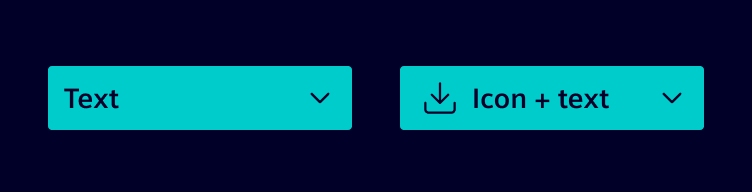
When to use
- When there is a need for actions, which are related to each other (e.g. Export: PDF, Excel, Word, ...).
- When users need to make a choice among a list of mutually exclusive options.
Best practices
- Minimal button width is
100px. - Menu container should be at least the same width as the button.
Design
Elements
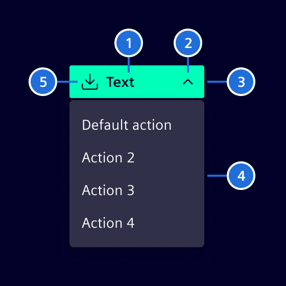
- Placeholder text, 2. Arrow, 3. Container, 4. menu container, 5. Icon (optional)
Variants
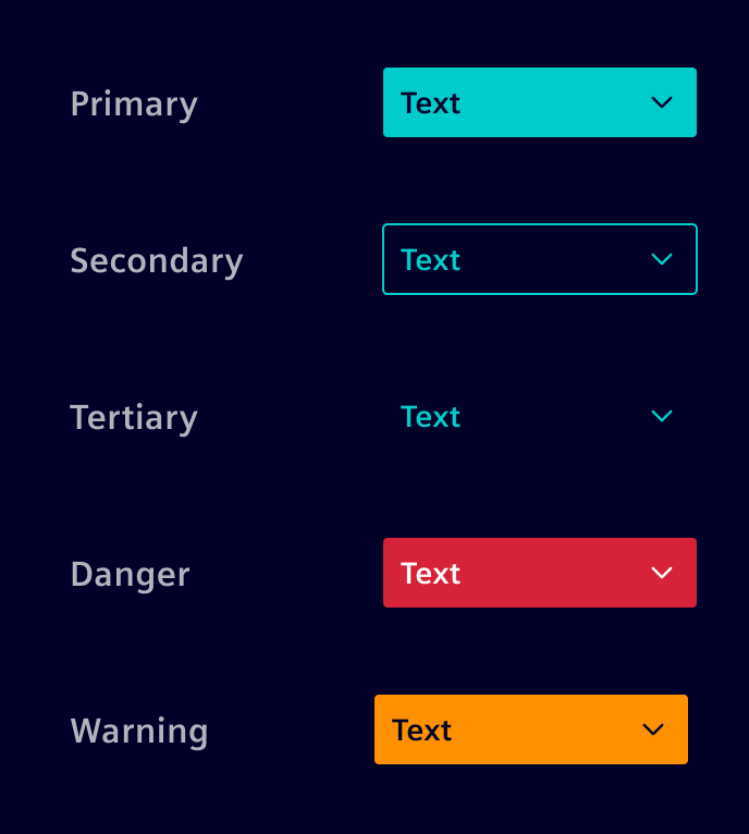
Interaction states are identical to the normal buttons.
Code
Dropdown menu
If the overlay should show a contextual menu, please use the menu component. It already implements specific keyboard interactions and aria roles that are needed for a dropdown menu.
Use a button with the dropdown-toggle class as the trigger and place the content in a dropdown-menu. Add a dropdown-caret icon to indicate that the button opens an overlay.
The theme provides the dropdown styles. Use the CDK Overlay module to create, position, and dismiss the overlay. The CDK directives can also be used with content that does not use the dropdown-menu class.
Basic markup
Use a button for actions and an anchor for navigation. Set aria-expanded to the current open state and add show to the trigger while the overlay is open so that the caret rotates.
<button
  #trigger="cdkOverlayOrigin"
  type="button"
  class="btn btn-primary dropdown-toggle"
  cdkOverlayOrigin
  [class.show]="open()"
  [attr.aria-expanded]="open()"
  (click)="open.set(true)"
>
  Actions
  <si-icon class="dropdown-caret icon" icon="element-down-2" />
</button>

<ng-template
  cdkConnectedOverlay
  cdkConnectedOverlayBackdropClass="cdk-overlay-transparent-backdrop"
  [cdkConnectedOverlayOpen]="open()"
  [cdkConnectedOverlayOrigin]="trigger"
  [cdkConnectedOverlayHasBackdrop]="true"
  (backdropClick)="open.set(false)"
  (detach)="open.set(false)"
>
  <div class="dropdown-menu position-static d-block">
    <button type="button" class="dropdown-item">Edit</button>
    <button type="button" class="dropdown-item">Duplicate</button>
    <div class="dropdown-divider"></div>
    <button type="button" class="dropdown-item">Delete</button>
  </div>
</ng-template>
The open state controls the overlay. Use a transparent backdrop to close it when the user clicks outside. Also update the state on (detach), which is emitted when the overlay closes, including after pressing Escape. The position-static and d-block utility classes allow the CDK to position the rendered menu.
For having a proper keyboard interaction, we are using the CDK Focus trap. It ensures that the focus will remain within the overlay while it is open. Enabling [cdkTrapFocusAutoCapture]="true" ensures, that the focus will be moved into the overlay on creation and returned to the trigger when the overlay is closed.
Directions
Wrap the trigger and menu in one of the direction classes to place a statically positioned menu relative to its trigger. The caret direction changes automatically.
| Class | Menu placement |
|---|---|
dropdown | Below the trigger |
dropup | Above the trigger |
dropstart | Before the trigger |
dropend | After the trigger |
<div class="dropend">
  <button type="button" class="btn btn-secondary dropdown-toggle">
    More actions
    <si-icon class="dropdown-caret icon" icon="element-down-2" />
  </button>
  <div class="dropdown-menu show">
    <button type="button" class="dropdown-item">Action</button>
  </div>
</div>
When using the CDK Overlay, configure the connected overlay positions instead. The direction classes are useful for menus that remain in the document flow or when the position is managed by the application.
Alignment
Use an alignment class on the dropdown-menu to align it with its trigger. align-start is the default placement.
| Class | Alignment |
|---|---|
align-start | Align the menu with the trigger start edge |
align-center | Center the menu on the trigger start edge |
align-end | Align the menu with the trigger end edge |
<div class="dropdown">
  <button type="button" class="btn btn-secondary dropdown-toggle">Actions</button>
  <div class="dropdown-menu show align-end">
    <button type="button" class="dropdown-item">Action</button>
  </div>
</div>
Menu content
Use dropdown-item for interactive actions. It supports the active and disabled states. Use dropdown-item-text for non-interactive content and dropdown-header to label a group of items. Use dropdown-divider to separate related groups.
<div class="dropdown-menu show">
  <div class="dropdown-header">Export</div>
  <button type="button" class="dropdown-item active">PDF</button>
  <button type="button" class="dropdown-item">Excel</button>
  <button type="button" class="dropdown-item" disabled>Word</button>
  <div class="dropdown-divider"></div>
  <div class="dropdown-item-text">Exports include the current filters.</div>
</div>
For items with icons, place the icon before an item-title. A trailing menu-end-icon can communicate an additional state or a follow-up action.
<button type="button" class="dropdown-item">
  <si-icon class="icon" icon="element-download" />
  <span class="item-title">Download</span>
  <si-icon class="menu-end-icon icon" icon="element-right-2" />
</button>
Long menus
dropdown-menu scrolls when its height exceeds the viewport. Add dropdown-menu-scroller to apply the recommended bounded height for menus with many items.
<div class="dropdown-menu dropdown-menu-scroller show">
  <!-- Dropdown items -->
</div>
Related components
Use button groups to create split-button patterns. Use the menu component when the content, see content actions.
CdkConnectedOverlay API Documentation
Directive to facilitate declarative creation of an Overlay using a FlexibleConnectedPositionStrategy.
Input Properties
| Name | Type | Description |
|---|---|---|
| (writeonly) cdkConnectedOverlay ¶ | (string | CdkConnectedOverlayConfig) | Shorthand for setting multiple overlay options at once. |
| cdkConnectedOverlayBackdropClass ¶ | (string | string[]) | The custom class to be set on the backdrop element. |
| cdkConnectedOverlayDisableClose ¶ | boolean | Whether the overlay can be closed by user interaction. |
| cdkConnectedOverlayDisposeOnNavigation ¶ | boolean | Whether the overlay should be disposed of when the user goes backwards/forwards in history. |
| cdkConnectedOverlayFlexibleDimensions ¶ | boolean | Whether the overlay's width and height can be constrained to fit within the viewport. |
| cdkConnectedOverlayGrowAfterOpen ¶ | boolean | Whether the overlay can grow after the initial open when flexible positioning is turned on. |
| cdkConnectedOverlayHasBackdrop ¶ | boolean | Whether or not the overlay should attach a backdrop. |
| cdkConnectedOverlayHeight ¶ | (string | number) | The height of the overlay panel. |
| cdkConnectedOverlayLockPosition ¶ | boolean | Whether or not the overlay should be locked when scrolling. |
| cdkConnectedOverlayMatchWidth ¶ | boolean | Whether the overlay should match the trigger's width. |
| cdkConnectedOverlayMinHeight ¶ | (string | number) | The min height of the overlay panel. |
| cdkConnectedOverlayMinWidth ¶ | (string | number) | The min width of the overlay panel. |
| cdkConnectedOverlayOffsetX ¶ | number | The offset in pixels for the overlay connection point on the x-axis |
| cdkConnectedOverlayOffsetY ¶ | number | The offset in pixels for the overlay connection point on the y-axis |
| cdkConnectedOverlayOpen ¶ | boolean | Whether the overlay is open. |
| cdkConnectedOverlayOrigin ¶ | (FlexibleConnectedPositionStrategyOrigin | CdkOverlayOrigin) | Origin for the connected overlay. |
| cdkConnectedOverlayPanelClass ¶ | (string | string[]) | The custom class to add to the overlay pane element. |
| cdkConnectedOverlayPositions ¶ | ConnectedPosition[] | Registered connected position pairs. |
| cdkConnectedOverlayPositionStrategy ¶ | FlexibleConnectedPositionStrategy | This input overrides the positions input if specified. It lets users pass in arbitrary positioning strategies. |
| cdkConnectedOverlayPush ¶ | boolean | Whether the overlay can be pushed on-screen if none of the provided positions fit. |
| cdkConnectedOverlayScrollStrategy ¶ | ScrollStrategy | Strategy to be used when handling scroll events while the overlay is open. |
| cdkConnectedOverlayTransformOriginOn ¶ | string | CSS selector which to set the transform origin. |
| cdkConnectedOverlayUsePopover ¶ | (FlexibleOverlayPopoverLocation | null) | Whether the connected overlay should be rendered inside a popover element or the overlay container. |
| cdkConnectedOverlayViewportMargin ¶ | ViewportMargin | Margin between the overlay and the viewport edges. |
| cdkConnectedOverlayWidth ¶ | (string | number) | The width of the overlay panel. |
Output Properties
| Name | Type | Description |
|---|---|---|
| (readonly) attach ¶ | EventEmitter<void> | Event emitted when the overlay has been attached. |
| (readonly) backdropClick ¶ | EventEmitter<MouseEvent> | Event emitted when the backdrop is clicked. |
| (readonly) detach ¶ | EventEmitter<void> | Event emitted when the overlay has been detached. |
| (readonly) overlayKeydown ¶ | EventEmitter<KeyboardEvent> | Emits when there are keyboard events that are targeted at the overlay. |
| (readonly) overlayOutsideClick ¶ | EventEmitter<MouseEvent> | Emits when there are mouse outside click events that are targeted at the overlay. |
| (readonly) positionChange ¶ | EventEmitter<ConnectedOverlayPositionChange> | Event emitted when the position has changed. |
Attributes and Methods
| Name | Type | Description |
|---|---|---|
| attachOverlay() ¶ | () => void | Attaches the overlay. |
| detachOverlay() ¶ | () => void | Detaches the overlay. |
| (readonly) dir ¶ | Direction | The element's layout direction. |
| (readonly) overlayRef ¶ | OverlayRef | The associated overlay reference. |
CdkOverlayOrigin API Documentation
Directive applied to an element to make it usable as an origin for an Overlay using a ConnectedPositionStrategy.
Attributes and Methods
| Name | Type | Description |
|---|---|---|
| elementRef ¶ | ElementRef<any> |
CdkTrapFocus API Documentation
Directive for trapping focus within a region.
Input Properties
| Name | Type | Description |
|---|---|---|
| cdkTrapFocus ¶ | boolean | Whether the focus trap is active. |
| cdkTrapFocusAutoCapture ¶ | boolean | Whether the directive should automatically move focus into the trapped region upon initialization and return focus to the previous activeElement upon destruction. |
Attributes and Methods
| Name | Type | Description |
|---|---|---|
| focusTrap ¶ | FocusTrap | Underlying FocusTrap instance. |
Types Documentation
No types to document for items on this page.
Except where otherwise noted, content on this site is licensed under MIT License.