Carousel
The carousel displays a set of related content in a horizontal row, allowing users to cycle through them automatically or with controls.
Usage
Use a carousel when users need to browse a small set of related items within limited space, and each item follows a consistent structure (e.g., same card layout, similar content density).
When to use
- To surface multiple related items.
- When content can be browsed one page at a time without losing context.
- When space is limited and showing all items at once would overwhelm the layout.
- In unattended display contexts (monitors, presentation screens) using slideshow mode with auto-play.
Best practices
- Keep slides consistent in height and content structure across pages.
- Always show the auto-play control so users can pause the carousel at any time.
- Avoid mixing slides with very different content types in the same carousel.
- Use the carousel for content that is genuinely browsable, where users benefit from seeing one page at a time.
- The pagination displays a minimum of 2 and a maximum of 7 dots at a time, regardless of the total number of slides.
Design
Anatomy
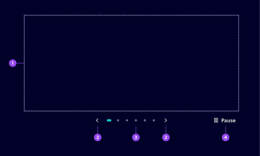
- Slides, 2. Navigation controls, 3, Pagination, 4. Pause/play
Except for the slides, all items are optional.
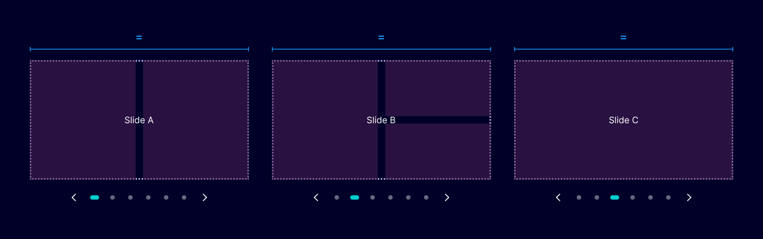
Slide layout
All slides within a carousel share the same width and height,
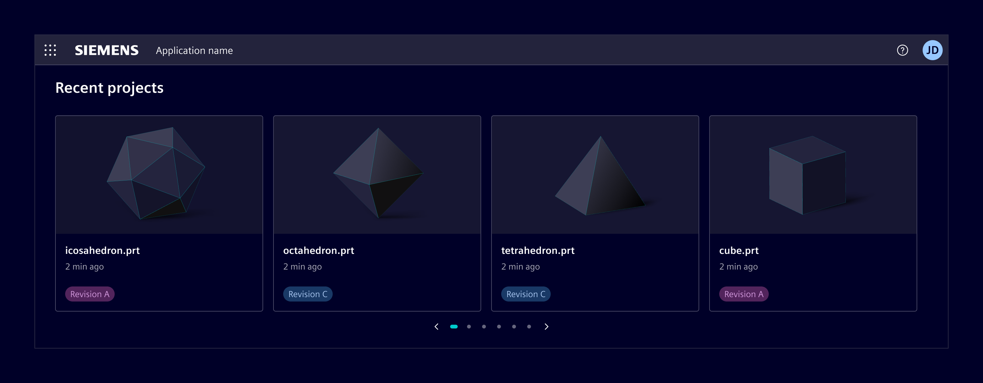
The carousel always shows one full-width slide. What goes inside that slot (one card, three cards, a grid, images) can be defined according to the use case.
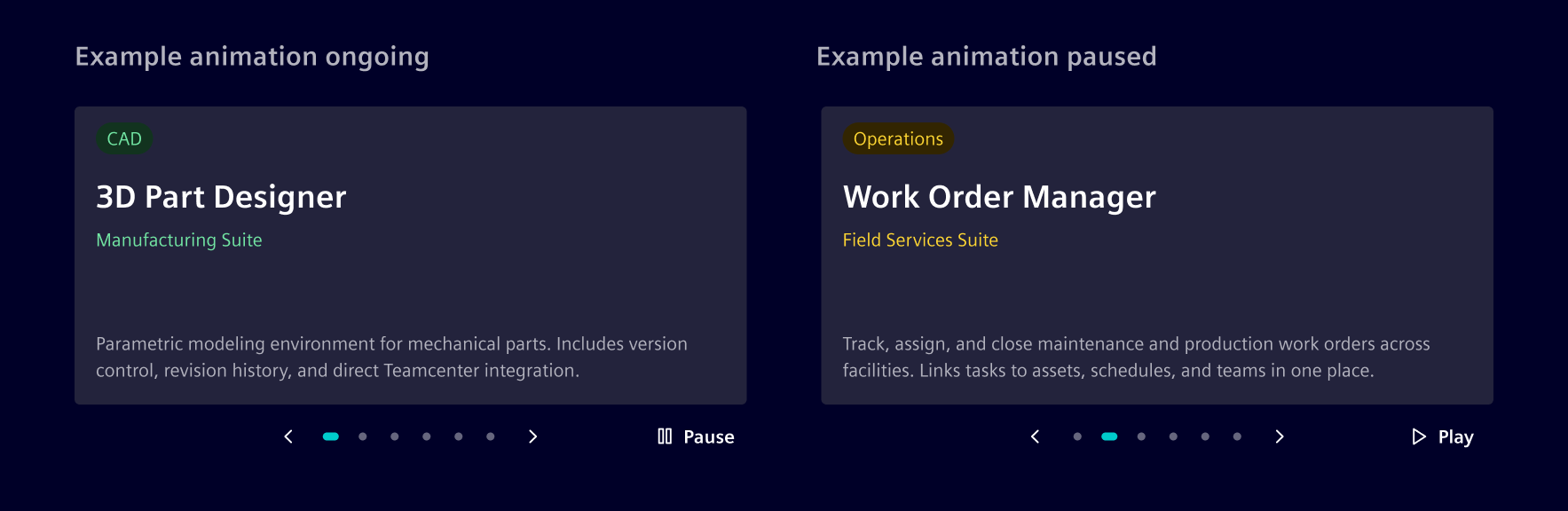
Auto-play
When auto-play is enabled, the carousel advances to the next slide after a configurable interval. A play/pause button is shown alongside the navigation controls so users can stop or resume at any time.
Auto-play works in both carousel and slideshow modes.
Slideshow mode
Slideshow mode expands the carousel to cover the entire viewport, hiding all application content including the app header. It is typically used for unattended display (monitors, presentation screens) and is commonly paired with auto-play.
Code
The si-carousel component uses the siCarouselItem directive to mark each slide. Slides are displayed horizontally with snap-scroll behavior.
Usage
import { SiCarouselComponent, SiCarouselItemDirective } from '@siemens/element-ng/carousel';

@Component({
  imports: [SiCarouselComponent, SiCarouselItemDirective, ...]
})
<si-carousel>
  <div siCarouselItem><h2>Slide 1</h2></div>
  <div siCarouselItem><h2>Slide 2</h2></div>
  <div siCarouselItem><h2>Slide 3</h2></div>
</si-carousel>
SiCarouselComponent API Documentation
si-carouselA carousel component for displaying slides with navigation controls and auto-play.
Features horizontal scrolling with snap behavior, pagination dots, and ARIA accessibility. Suitable for dashboards, image galleries, and content showcases.
Example:
typescript
import { SiCarouselComponent, SiCarouselItemDirective } from '@siemens/element-ng/carousel';

@Component({
  imports: [SiCarouselComponent, SiCarouselItemDirective],
  template: `
    <si-carousel>
      <div siCarouselItem><h2>Slide 1</h2></div>
      <div siCarouselItem><h2>Slide 2</h2></div>
      <div siCarouselItem><h2>Slide 3</h2></div>
    </si-carousel>
  `
})
export class MyComponent {}
Input Properties
| Name | Type | Default | Description |
|---|---|---|---|
| ariaRole ¶ | ("group" | "region") | 'region' | Aria role of the carousel element. Can be set to 'region' or 'group' depending on the desired accessibility semantics. |
| autoPlay ¶ | (number | boolean) | false | Enables or configures auto-play for the carousel. When set to true , the carousel automatically navigates to the next slide every 5000 milliseconds (5 seconds). Pass a positive number to set a custom interval in milliseconds. Pass false to disable auto-play. |
| carouselRoleDescription ¶ | TranslatableString | $localize`:@@SI_CAROUSEL.ROLE_DESCRIPTION:carousel` | Role description for the carousel container, used for accessibility purposes. |
| hidePageControls ¶ | boolean | false | Controls whether pagination controls are shown. When true , the carousel shows one slide per page and hides pagination controls. |
| nextButtonAriaLabel ¶ | TranslatableString | $localize`:@@SI_CAROUSEL.NEXT:Next slide` | Aria label for the next button, used for accessibility purposes. |
| pauseButtonLabel ¶ | TranslatableString | $localize`:@@SI_CAROUSEL.PAUSE:Pause` | Label for the pause button when autoplay is active. |
| playButtonLabel ¶ | TranslatableString | $localize`:@@SI_CAROUSEL.PLAY:Play` | Label for the play button when autoplay is paused. |
| previousButtonAriaLabel ¶ | TranslatableString | $localize`:@@SI_CAROUSEL.PREVIOUS:Previous slide` | Aria label for the previous button, used for accessibility purposes. |
| slidePageAriaLabel ¶ | TranslatableString | $localize`:@@SI_CAROUSEL.SLIDE_PAGE:Slide {{page}} of {{total}}` | |
| slideRoleDescription ¶ | TranslatableString | $localize`:@@SI_CAROUSEL.SLIDE_ROLE_DESCRIPTION:Slide` | Role description for each slide, used for accessibility purposes. |
Types Documentation
| Represents a translatable string. This can either be a translation key, e.g. ACTIONS.EDIT that will be automatically translated when displayed on the UI or a pre-translated string, e.g. Edit . Equivalent to a normal string in usage and functionality. |
|---|
Translatable import imported from @siemens/element-translate-ng |
|---|
Except where otherwise noted, content on this site is licensed under MIT License.