Weather dashboard widget
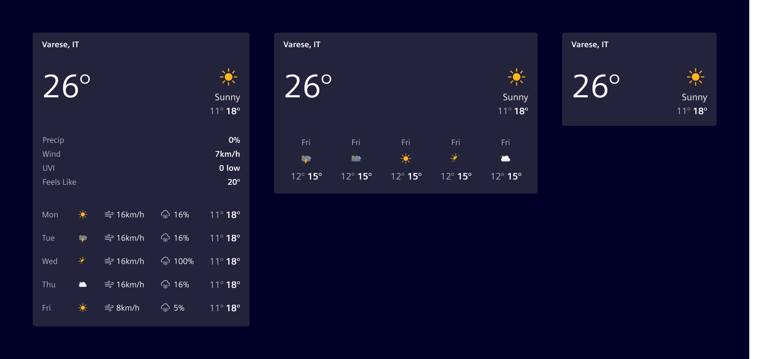
Weather dashboard widget displays current weather conditions and, optionally, a short-term forecast for a single location.
Usage
The weather dashboard widget displays current temperature and sky conditions, with an optional short-term forecast and additional meteorological parameters like humidity or wind speed.
The widget supports different layouts, and both the forecast days and the number of additional meteological parameters can be configured according to the use case.
When to use
- In dashboards and tile layouts.
- To display current outdoor or environmental conditions.
- To offer users a quick overview of the day's or week's weather.
Best practices
- Show only the metrics most relevant to the context.
- Keep units consistent (e.g. °C or °F, km/h or mph).
- Pick the layout that matches the available tile size.
- Use a skeleton to represent the loading state.
Design
Elements
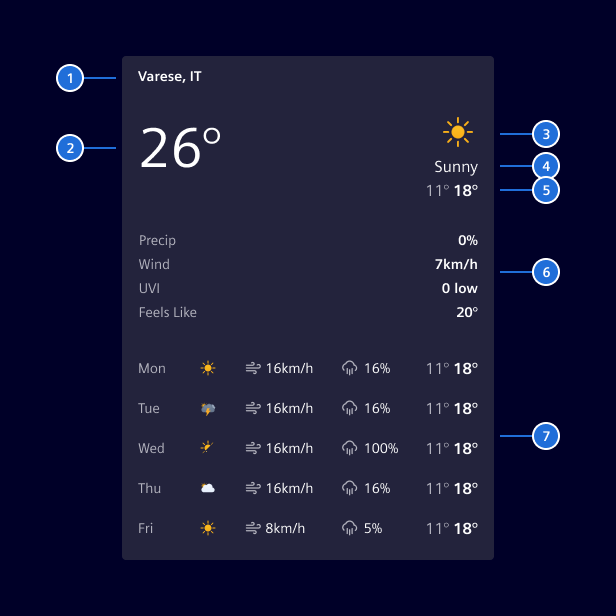
1. Heading (location), 2. Current temperature, 3. Illustration, 4. Condition label, 5. Min/Max range, 6. Additional metrics (optional), 7. Forecast (optional)
Layout variants
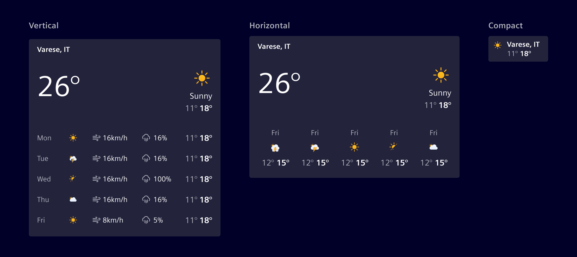
The widget supports three layouts:
- Vertical: Forecast with up to five columns of additional data (e.g., wind, precipitation, humidity, UV, pressure).
- Horizontal: Forecast with condition and temperature only.
- Compact: No forecast.
The forecast shows up to seven days. The number of days is configurable. Columns are hidden automatically as the widget narrows.
Icon style
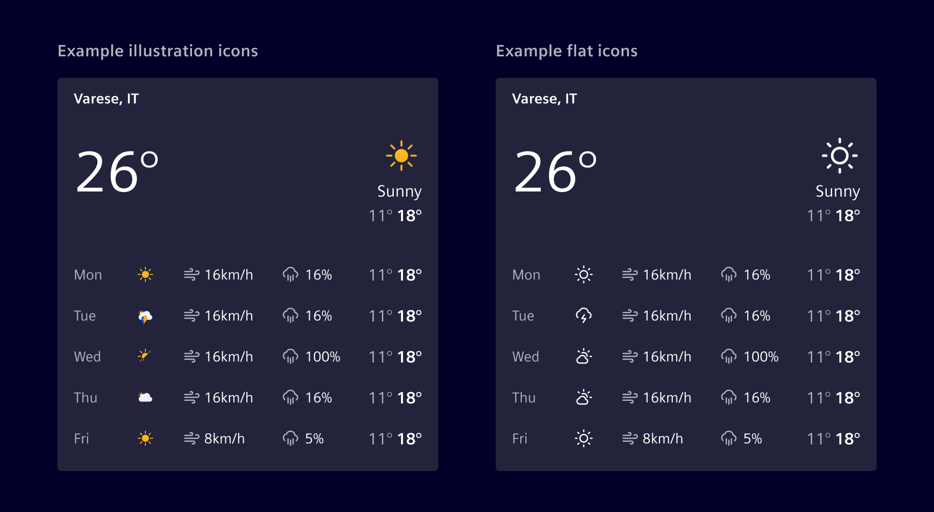
Weather conditions can be represented with flat Element icons or illustrated icons. For illustrated icons, the style may vary depending on the weather provider.
Code
The weather widget is built around two Angular components: the widget itself, which wraps an <si-card>, and a body component that can be reused for compositions.
Component usage
To simplify the usage and reduce the code, Element offers an Angular component as a wrapper with streamlined inputs.
import { SiWeatherWidgetComponent } from '@siemens/element-ng/dashboard';

@Component({
  :
  imports: [SiWeatherWidgetComponent]
})
SiWeatherWidgetComponent API Documentation
si-weather-widgetDashboard widget for current weather conditions, additional metrics and an optional multi-day forecast.
The widget supports three layouts (see SiWeatherWidgetLayout ):
vertical(default): full vertical card with<si-card>heading, illustration, today block, optional additional data and an optional forecast table with up to two extra columns.horizontal: wider card with the today block laid out side by side and a horizontal forecast strip below. The forecast SHOULD contain at least three days for a visually balanced layout.compact: condensed variant without a card header. The location is rendered next to the illustration. The forecast is not shown.
Data is supplied as a composite value payload of type SiWeatherWidgetData .
Weather illustrations are resolved by an optional SiWeatherIconResolver that application developers register. Without a resolver the widget only renders illustrations when callers pass a direct illustration.src .
Input Properties
| Name | Type | Default | Description |
|---|---|---|---|
| accentLine ¶ | AccentLineType | Optional accent line. | |
| disableAutoLoadingIndicator ¶ | boolean | false | Option to disable automatic start of skeleton loading indication. |
| heading ¶ | TranslatableString | Card heading text. Used as the card header in vertical and horizontal layouts. In the compact layout, the location is rendered inside the body instead and this input is ignored. | |
| imgAlt ¶ | TranslatableString | Alt text for a provided image. | |
| imgDir ¶ | ("horizontal" | "vertical") | 'vertical' | Defines if an image is placed on top or start (left) of the card. |
| imgObjectFit ¶ | ("fill" | "none" | "contain" | "cover" | "scale-down") | 'scale-down' | Sets the image object-fit CSS property. |
| imgObjectPosition ¶ | string | Sets the image object-position CSS property. | |
| imgSrc ¶ | string | Image source for the card. | |
| initialLoadingIndicatorDebounceTime ¶ | number | 300 | Initial delay time in milliseconds before enabling loading indicator. Only used once initially during construction. |
| layout ¶ | SiWeatherWidgetLayout | 'vertical' | Visual layout. SiWeatherWidgetLayout . |
| location ¶ | TranslatableString | Location displayed next to the illustration in the compact layout. Has no effect in vertical or horizontal layouts; use heading there. | |
| primaryActions ¶ | ContentActionBarMainItem[] | [] | Input list of primary action items. Supports up to 4 actions and omits additional ones. |
| secondaryActions ¶ | MenuItem[] | [] | Input list of secondary action items. |
| showLoadingIndicator ¶ | boolean | false | Input to start and stop the skeleton loading indication. |
| value ¶ | SiWeatherWidgetData | Composite weather payload of type SiWeatherWidgetData . |
Weather widget body component
The body of <si-weather-widget> is implemented in the component <si-weather-widget-body>. You can use it for compositions where the <si-card> wrapper is not appropriate.
SiWeatherWidgetBodyComponent API Documentation
si-weather-widget-bodyBody of the <si-weather-widget> . Useful for compositions that do not need the surrounding <si-card> chrome (e.g. embedding the weather inside a custom container).
Data is supplied as a composite value payload of type SiWeatherWidgetData .
The body delegates illustration resolution to the injected SiWeatherIconResolver . The library ships a default resolver that maps the built-in SiWeatherCondition vocabulary to Element icons.
In the vertical layout the forecast list responsively hides additional data columns (wind, humidity, …) via pure CSS container queries when the widget becomes too narrow. See si-weather-widget-body.component.scss for the thresholds.
Input Properties
| Name | Type | Default | Description |
|---|---|---|---|
| disableAutoLoadingIndicator ¶ | boolean | false | Option to disable automatic start of skeleton loading indication. |
| forecastLabel ¶ | TranslatableString | $localize`:@@SI_WEATHER_WIDGET.FORECAST_LABEL:Weather forecast` | Accessible label for the forecast section. |
| initialLoadingIndicatorDebounceTime ¶ | number | 300 | Initial delay time in milliseconds before enabling loading indicator. Only used once initially during construction. |
| layout ¶ | SiWeatherWidgetLayout | 'vertical' | Visual layout. SiWeatherWidgetLayout . |
| location ¶ | TranslatableString | Optional location label, shown inside the body in the compact layout only. The non-compact layouts render the location via the <si-card> heading managed by SiWeatherWidgetComponent . | |
| metricsLabel ¶ | TranslatableString | $localize`:@@SI_WEATHER_WIDGET.METRICS_LABEL:Additional weather data` | Accessible label for the additional data list. |
| showLoadingIndicator ¶ | boolean | false | Input to start and stop the skeleton loading indication. |
value ¶ ¶ | (SiWeatherWidgetData | undefined) | The main value to be displayed. If no value is set, the skeleton indicates the loading of the value. Disable the automatic loading mechanism by setting SiWidgetBodyBaseComponent.disableAutoLoadingIndicator . |
Attributes and Methods
| Name | Type | Default | Description |
|---|---|---|---|
| ngOnChanges() ¶ | () => void | A callback method that is invoked immediately after the default change detector has checked data-bound properties if at least one has changed, and before the view and content children are checked. | |
| ngOnInit() ¶ | () => void | A callback method that is invoked immediately after the default change detector has checked the directive's data-bound properties for the first time, and before any of the view or content children have been checked. It is invoked only once when the directive is instantiated. | |
| (readonly) showLoadingIndicator ¶ | Signal<boolean> | ... |
Configurable playground
The configurable example exposes every input of the widget and is useful for exploring layouts, metrics and forecast extras interactively.
Icon resolver
Weather illustrations are produced by an injectable SiWeatherIconResolver. The library ships a default resolver that maps the built-in SiWeatherCondition vocabulary (clear, clouds, rain, storm, wind, unknown) to Element icons:
| Condition | Icon |
|---|---|
clear | element-sun |
clouds | element-cloudy |
rain | element-rain |
storm | element-storm |
wind | element-wind |
unknown | (no icon) |
Applications can override the default by providing their own resolver. A resolver returns either an Element icon name (rendered via <si-icon>) or a direct image URL (rendered as <img>); callers can also pass an src directly via illustration.src to bypass the resolver.
Implementing a custom resolver
A custom resolver extends SiWeatherIconResolver and returns one of:
{ icon: '<name>' }— rendered as<si-icon icon="…">.{ src: '<url>' }— rendered as<img src="…">.null— no illustration is shown.
The example below uses the MIT-licensed meteocons static SVG set (@meteocons/svg-static). The icons are exposed via angular.json under /assets/meteocons/:
// angular.json (assets array)
{
  "glob": "*.svg",
  "input": "node_modules/@meteocons/svg-static/fill",
  "output": "/assets/meteocons/"
}
The resolver is a small class that maps the six built-in condition tokens to file names. For more complex scenarios, you can introduce or reuse a richer condition vocabulary. It is registered as a component-level provider, so the override is scoped to this example:
providers: [{ provide: SiWeatherIconResolver, useClass: SiWeatherWidgetMeteoconsIconResolver }];
For an application-wide override, register the resolver in the root injector instead (providedIn: 'root' on the class itself, or via providers in bootstrapApplication).
SiWeatherIconResolver API Documentation
API not found.
Types Documentation
| Visual layout of the SiWeatherWidgetComponent . - vertical : full vertical card layout with header, today block, optional additional data and an optional vertical forecast table. - horizontal : wider card with the today block laid out side by side and a horizontal forecast strip below. - compact : condensed card without a card header. Location and min/max temperature are rendered next to the illustration. Does not show a forecast. |
|---|
| Composite payload accepted by the body component. Granular widget/body inputs ( current , metrics , forecast ) take precedence when set. | ||||
|---|---|---|---|---|
|
| Represents a translatable string. This can either be a translation key, e.g. ACTIONS.EDIT that will be automatically translated when displayed on the UI or a pre-translated string, e.g. Edit . Equivalent to a normal string in usage and functionality. |
|---|
Translatable import imported from @siemens/element-translate-ng |
|---|
|
|
|
| Represents a menu item that navigates using the Angular Router. Requires a configured Angular Router. | |||||||||||
|---|---|---|---|---|---|---|---|---|---|---|---|
|
|
|
|
|
|
| Today block of the weather widget. | |||||||
|---|---|---|---|---|---|---|---|
|
| Forecast block of the weather widget. The vertical layout supports up to two optional columns in addition to the mandatory rightmost min/max temperature column. The horizontal layout ignores columns and renders only day label, illustration and min/max temperature per column. A horizontal forecast should provide at least three days for a visually balanced layout. | |||
|---|---|---|---|
|
| A single metric row in the additional-data block (e.g. wind, precipitation). | |||
|---|---|---|---|
|
|
| Implement and provide this to an SiMenuFactoryComponent to receive trigger events. | |||||||
|---|---|---|---|---|---|---|---|
| |||||||
|
| Describes how a weather illustration should be resolved. Callers can either provide a direct SiWeatherIcon.src or a semantic SiWeatherIcon.condition token resolved by a SiWeatherIconResolver . | ||||
|---|---|---|---|---|
|
| An optional forecast column shown left of the temperature column in vertical layouts. The widget supports up to five of these columns; additional columns are ignored. The temperature column is mandatory and always rendered on the right; it does not need to be modelled as a column here. | ||||
|---|---|---|---|---|
|
| A single day in the forecast block. | |||||
|---|---|---|---|---|---|
|
| Built-in weather condition vocabulary. Mapped 1:1 by the library's default SiWeatherIconResolver to Element icons. Applications that need provider-specific vocabularies (Xweather, OpenWeather, …) should register their own resolver and may accept any string in their public APIs. |
|---|
| Result returned by a SiWeatherIconResolver . Implementations should return either icon (rendered via <si-icon> ) or src (rendered as a plain <img> ). When both are present, icon wins. | ||||
|---|---|---|---|---|
|
Constructor |
|---|
| Used in events emitted from SiLinkActionService | |||
|---|---|---|---|
|
|
import imported from @types/node |
|---|
| |||||||||||||||||||||
| |||||||||||||||||||||
|
| Maps a semantic SiWeatherIcon to a renderable illustration. The library ships a SiDefaultWeatherIconResolver that maps the built-in SiWeatherCondition vocabulary to Element icons, so the widget renders a reasonable illustration out of the box. Applications can override the mapping or add provider-specific vocabularies by registering their own resolver: Example: Resolvers SHOULD return null for unknown or 'unknown' conditions so the widget can skip the illustration. | ||||||
|---|---|---|---|---|---|---|
| ||||||
|
| Built-in resolver that maps the library's minimal SiWeatherCondition vocabulary to Element icons: - clear → element-sun - clouds → element-cloudy - rain → element-rain - storm → element-storm - wind → element-wind - unknown → no illustrationUnknown tokens fall through to null so callers can register a more capable resolver without losing the built-in fallback. | ||||||
|---|---|---|---|---|---|---|
| ||||||
|
| |||||||
| |||||||
|
Except where otherwise noted, content on this site is licensed under MIT License.