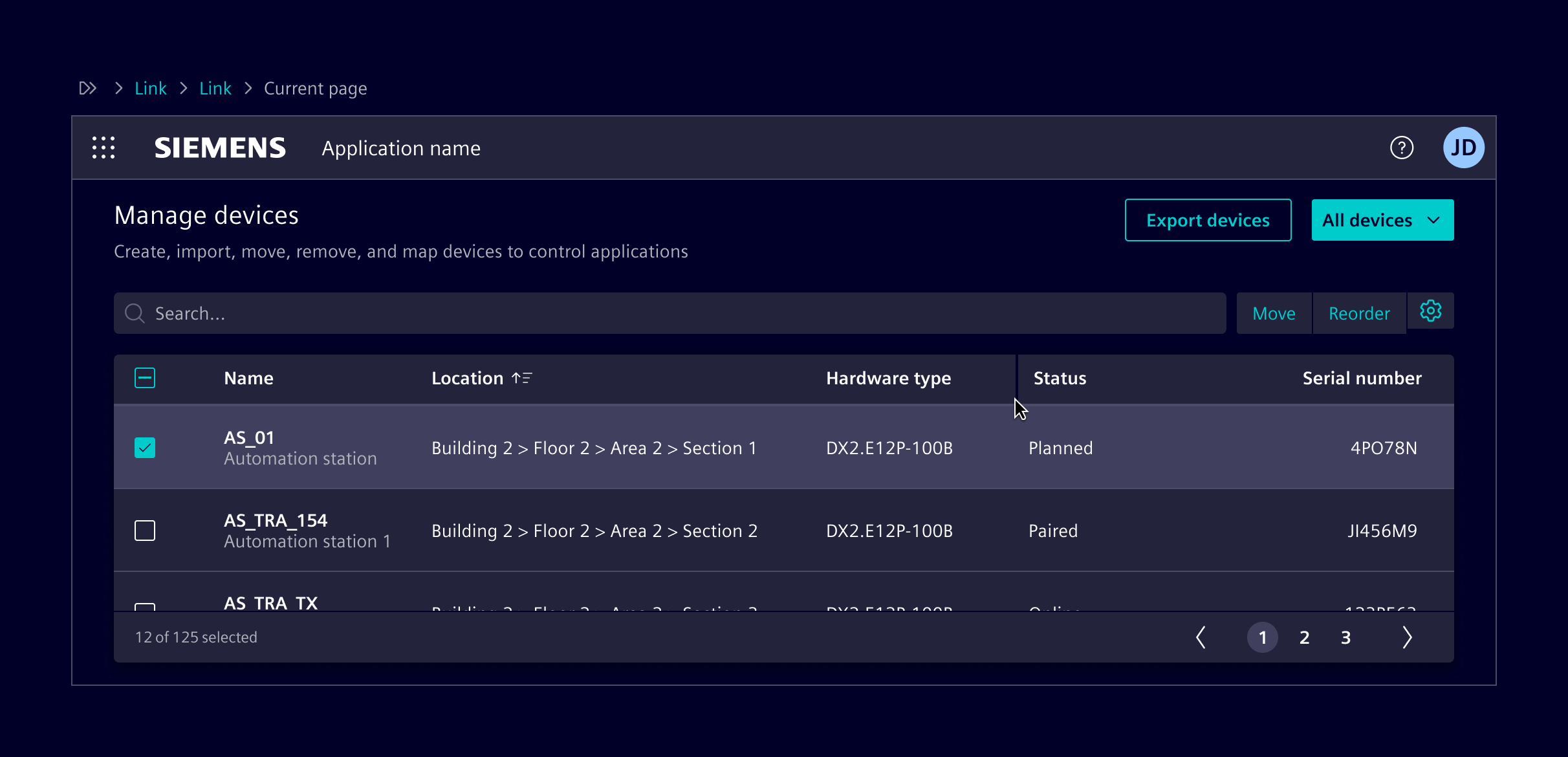
NGX-datatable
NGX-datatable is the default solution for large and interactive tables. It is open-source software under MIT license and maintained by Siemens.
Usage
It supports sorting, filtering, paging, selection, virtualization, and keyboard interaction, while remaining flexible about data handling.
When to use
- To handle large datasets.
- When sorting, filtering, paging, or selection is required.
- To support column reordering.
- To support empty states (client or server).
- To support server-side filtering and sorting.
- To support grouped or tree rows
- To support row dragging.
- To support sticky columns.
- When looking for a free open-source solution.
Code
Note: The ngx-datatable implements change detection based on immutable table data. E.g. when only the content of a particular cell has changed, this change is not detected by the ngx change detection. See also the remark in the ngx-datatable documentation.
Usage
ngx-datatable is an Angular component for presenting large and complex data. The table is designed to be flexible and light. It doesn't make any assumptions about the data or how you filter, sort or page it. Check out the full documentation, demos and the demo code for more information!Required Packages
import { NgxDatatableModule } from '@siemens/ngx-datatable';
import { SI_DATATABLE_CONFIG, SiDatatableModule, provideSiDatatableConfig } from '@siemens/element-ng/datatable';

// standalone apps
export const APP_CONFIG: ApplicationConfig = {
  providers: [
    ...
    provideSiDatatableConfig()
    // For smaller row heights:
    // provideSiDatatableConfig({rowHeight: SI_DATATABLE_CONFIG.rowHeightSmall})
  ]
};

// module based apps
@NgModule({
  imports: [
    NgxDatatableModule.forRoot(SI_DATATABLE_CONFIG),
    // For smaller row heights:
    // NgxDatatableModule.forRoot({ ...SI_DATATABLE_CONFIG, rowHeight: SI_DATATABLE_CONFIG.rowHeightSmall }),
    SiDatatableModule,
    // ...
  ]
})
Style configuration
No additional configuration is necessary as everything is already provided in the Element theme.
Keyboard interaction
To have the correct keyboard interaction, use the siDatatableInteraction directive.
Right align columns
There is a small but powerful trick how to right align columns with ngx-datatable. Notice how the Age column is right aligned in the example below. In the TypeScript code you can see that the table columns support two properties called headerClass and cellClass that can be used to apply a CSS class to the column header as well as the column's body cells:
{
  headerClass: 'justify-content-end', // right align column header
  cellClass: 'text-align-right-cell' // right align body cell
}
For the headerClass you can use the existing Bootstrap utility class justify-content-end to right align the column header. For the cellClass you have to define your own custom class text-align-right-cell and add the following SCSS code in your stylesheet:
::ng-deep {
  // center align datatable cell
  .text-align-right-cell .datatable-body-cell-label {
    flex: 1;
    text-align: end;
  }
}
Client-side paging, sorting and selection options
- Use
class="table-element"on<ngx-datatable>. - Use the pagination component as custom footer template with
ngx-datatable-footerand map inputs and outputs.
Server-side paging
Datatable component configured for server-side paging and lazy loading.
Vertical scroll
This example shows a table that grows to the maximum available height, using the layout-fixed-height class (see also Content Layouts). The property scrollbarV is used to enable vertical scrolling within the table. Enabling scrollbarVDynamic removes the scrollbar width from the row width only when actually needed.
Infinite scroll
Datatable component configured for server-side virtual paging. The data is loaded in pages from the server.
Empty state
Use the <si-empty-state></si-empty-state> for an empty table.
Selection
Datatable with a selection. Use the datatableInteractionAutoSelect input of the siDatatableInteraction directive to have it automatically select on keyboard navigation.
Filter and sort
Responsive
Fix height
Sticky columns with horizontal scroll
Reordering rows using Angular CDK Drag and Drop
Column management
Resizing
Datatables do have a fixed, automatically updated size, assumed during their initial rendering and refreshed during screen-size changes. However, they are not automatically refreshed in case their parent container changes size. It is the responsibility of a consuming application to invoke a recalculation if such an event occurs. Such a recalculation can be initiated by using the recalculate() function, exposed by the component.
// ...

@ViewChild(DatatableComponent) table?: DatatableComponent;

// ...

resizeTable() {
  setTimeout(() => this.table?.recalculate());
}
Note: For the component to obtain the correct size information, the recalculation has to happen after the actual resizing event. To ensure that, the
setTimeout()has to be used.
The recalculation can either be triggered whenever changes on the DOM are made (e.g. when panels are collapsed/expanded) or by using Element's siResizeObserver directive. If you use siResizeObserver directive ensure that you have imported SiResizeObserverDirective in your standalone component or module.
<ngx-datatable (siResizeObserver)="resizeTable()" ...></ngx-datatable>
DatatableComponent API Documentation
Input Properties
| Name | Type | Description |
|---|---|---|
| columnMode ¶ | ColumnMode | Type of column width distribution formula. Example: flex, force, standard |
| columns ¶ | TableColumn<any>[] | Columns to be displayed. |
| count ¶ | number | The total count of all rows. Default value: 0 |
| cssClasses ¶ | Partial<NgxDatatableCssClasses> | Css class overrides |
| disableRowCheck ¶ | (row: TRow) => boolean | A function you can use to check whether you want to disable a row. Example: (row) => |
| displayCheck ¶ | (row: TRow, column: TableColumn, value: any) => boolean | A function you can use to check whether you want to show the checkbox for a particular row based on a criteria. Example: (row, column, value) => |
| enableClearingSortState ¶ | boolean | A flag to controll behavior of sort states. By default sort on column toggles between ascending and descending without getting removed. Set true to clear sorting of column after performing ascending and descending sort on that column. |
| externalPaging ¶ | boolean | If the table should use external paging otherwise its assumed that all data is preloaded. |
| externalSorting ¶ | boolean | If the table should use external sorting or the built-in basic sorting. |
| footerHeight ¶ | number | The minimum footer height in pixels. Pass falsey for no footer |
| ghostLoadingIndicator ¶ | boolean | Show ghost loaders on each cell. Default value: false |
| groupedRows ¶ | Group<TRow>[] | This attribute allows the user to set a grouped array in the following format: [ {groupid=1} [ {id=1 name="test1"}, {id=2 name="test2"}, {id=3 name="test3"} ]}, {groupid=2>[ {id=4 name="test4"}, {id=5 name="test5"}, {id=6 name="test6"} ]} ] |
| groupExpansionDefault ¶ | boolean | A boolean you can use to set the detault behaviour of rows and groups whether they will start expanded or not. If ommited the default is NOT expanded. |
| groupRowsBy ¶ | keyof TRow | This attribute allows the user to set the name of the column to group the data with |
| headerHeight ¶ | (number | "auto") | The minimum header height in pixels. Pass a falsey for no header |
| limit ¶ | number | The page size to be shown. Default value: undefined |
| loadingIndicator ¶ | boolean | Show the linear loading bar. Default value: false |
| messages ¶ | Partial<NgxDatatableMessages> | Message overrides for localization |
| (readonly) offsetChange ¶ | ModelSignal<number> | The current offset ( page - 1 ) shown. Default value: 0 |
| reorderable ¶ | boolean | Enable/Disable ability to re-order columns by dragging them. |
| rowClass ¶ | (row: TRow) => (string | Record<string, boolean>) | A function which is called with the row and should return either: - a string: "class-1 class-2 - a Record: { 'class-1': true, 'class-2': false } |
| rowDraggable ¶ | boolean | A flag to enable drag behavior of native HTML5 drag and drop API on rows. If set to true, rowDragEvents will emit dragstart and dragend events. |
| rowHeight ¶ | (number | "auto" | (row: TRow) => number) | The row height; which is necessary to calculate the height for the lazy rendering. |
| rowIdentity ¶ | (x: RowOrGroup<TRow>) => unknown | This will be used when displaying or selecting rows. when tracking/comparing them, we'll use the value of this fn, ( fn(x) === fn(y) instead of x === y ) |
| rows ¶ | ((TRow | undefined)[] | null) | Rows that are displayed in the table. |
| scrollbarH ¶ | boolean | Enable horz scrollbars |
| scrollbarV ¶ | boolean | Enable vertical scrollbars |
| scrollbarVDynamic ¶ | boolean | Enable vertical scrollbars dynamically on demand. Property scrollbarV needs to be set true too. Width that is gained when no scrollbar is needed is added to the inner table width. |
| selectAllRowsOnPage ¶ | boolean | Property to which you can use for determining select all rows on current page or not. |
| selectCheck ¶ | (value: TRow, index: number, array: TRow[]) => boolean | A boolean/function you can use to check whether you want to select a particular row based on a criteria. Example: (selection) => |
| (readonly) selectedChange ¶ | ModelSignal<TRow[]> | List of row objects that should be represented as selected in the grid. Default value: [] |
| selectionType ¶ | SelectionType | Type of row selection. Options are: - single - multi - checkbox - multiClick - cell For no selection pass a falsey . Default value: undefined |
| (readonly) sortsChange ¶ | ModelSignal<SortPropDir[]> | Array of sorted columns by property and type. Default value: [] |
| sortType ¶ | SortType | The type of sorting |
| summaryHeight ¶ | number | A height of summary row |
| summaryPosition ¶ | string | A property holds a summary row position: top/bottom |
| summaryRow ¶ | boolean | A flag for switching summary row on / off |
| swapColumns ¶ | boolean | Swap columns on re-order columns or move them. |
| targetMarkerTemplate ¶ | TemplateRef<unknown> | Template for the target marker of drag target columns. |
| trackByProp ¶ | keyof TRow | Property to which you can use for custom tracking of rows. Example: 'name' |
| treeFromRelation ¶ | string | Tree from relation |
| treeToRelation ¶ | string | Tree to relation |
| virtualization ¶ | boolean | A flag for row virtualization on / off |
Output Properties
| Name | Type | Description |
|---|---|---|
| activate ¶ | ActivateEvent<TRow> | A cell or row was focused via keyboard or mouse click. |
| (readonly) offsetChange ¶ | ModelSignal<number> | The current offset ( page - 1 ) shown. Default value: 0 |
| page ¶ | PageEvent | The table was paged either triggered by the pager or the body scroll. |
| reorder ¶ | ReorderEvent | Columns were re-ordered. |
| resize ¶ | ColumnResizeEvent | Column was resized. |
| rowDragEvents ¶ | DragEventData | Emits HTML5 native drag events. Only emits dragenter, dragover, drop events by default. Set rowDraggable to true for dragstart and dragend. |
| scroll ¶ | ScrollEvent | Body was scrolled typically in a scrollbarV:true scenario. |
| (readonly) selectedChange ¶ | ModelSignal<TRow[]> | List of row objects that should be represented as selected in the grid. Default value: [] |
| (readonly) sortsChange ¶ | ModelSignal<SortPropDir[]> | Array of sorted columns by property and type. Default value: [] |
| tableContextmenu ¶ | ContextMenuEvent<TRow> | The context menu was invoked on the table. type indicates whether the header or the body was clicked. content contains either the column or the row that was clicked. |
| treeAction ¶ | { row: TRow, rowIndex: number } | A row was expanded ot collapsed for tree |
select ¶ ¶ | SelectEvent<TRow> | A cell or row was selected. Deprecated: Use two-way binding on selected instead.Before: <ngx-datatable [selected]="mySelection" (select)="onSelect($event)"></ngx-datatable> After: <ngx-datatable [selected]="mySelection" (selectedChange)="onSelect({selected: $event})"></ngx-datatable> <!-- or --> <ngx-datatable [(selected)]="mySelection"></ngx-datatable> |
| sort¶ | SortEvent | Column sort was invoked. Deprecated: Use two-way binding on sorts instead.Before: <ngx-datatable [sorts]="mySorts" (sort)="onSort($event)"></ngx-datatable> After: ```html |
Methods
Method Recalc's the sizes of the grid. Updated automatically on changes to: - Columns - Rows - Paging related Also can be manually invoked or upon window resize. |
|---|
SiDatatableInteractionDirective API Documentation
ngx-datatable[siDatatableInteraction]si-datatable-interactionInput Properties
| Name | Type | Default | Description |
|---|---|---|---|
| datatableInteractionAutoSelect ¶ | boolean | false | Automatically select every row or cell that is navigated trough. Is ignored unless selectionType is single or cell . |
Types Documentation
| Deprecated: The constant ColumnMode should no longer be used. Instead use the value directly: |
|---|
| Column Type | ||||||||||||||||||||||||||||
|---|---|---|---|---|---|---|---|---|---|---|---|---|---|---|---|---|---|---|---|---|---|---|---|---|---|---|---|---|
|
import imported from @siemens/ngx-datatable |
|---|
import imported from @siemens/ngx-datatable |
|---|
import imported from @siemens/ngx-datatable |
|---|
| Deprecated: The constant SelectionType should no longer be used. Instead use the value directly: |
|---|
import imported from @siemens/ngx-datatable |
|---|
| Deprecated: The constant SortType should no longer be used. Instead use the value directly: |
|---|
import imported from @siemens/ngx-datatable |
|---|
import imported from @siemens/ngx-datatable |
|---|
import imported from @siemens/ngx-datatable |
|---|
import imported from @siemens/ngx-datatable |
|---|
import imported from @siemens/ngx-datatable |
|---|
import imported from @siemens/ngx-datatable |
|---|
import imported from @siemens/ngx-datatable |
|---|
import imported from @siemens/ngx-datatable |
|---|
import imported from @siemens/ngx-datatable |
|---|
Variable Deprecated: The constant ColumnMode should no longer be used. Instead use the value directly: |
|---|
import imported from @siemens/ngx-datatable |
|---|
Variable Deprecated: The constant SelectionType should no longer be used. Instead use the value directly: |
|---|
Variable Deprecated: The constant SortType should no longer be used. Instead use the value directly: |
|---|
import imported from @siemens/ngx-datatable |
|---|
import imported from @siemens/ngx-datatable |
|---|
| Column property that indicates how to retrieve this column's value from a row. 'a.deep.value', 'normalprop', 0 (numeric) |
|---|
import imported from @siemens/ngx-datatable |
|---|
import imported from @siemens/ngx-datatable |
|---|
import imported from @siemens/ngx-datatable |
|---|
import imported from @siemens/ngx-datatable |
|---|
| imported from @siemens/ngx-datatable |
|---|
| imported from @siemens/ngx-datatable |
|---|
import imported from @siemens/ngx-datatable |
|---|
import imported from @siemens/ngx-datatable |
|---|
| imported from @siemens/ngx-datatable |
|---|
import imported from @siemens/ngx-datatable |
|---|
Except where otherwise noted, content on this site is licensed under MIT License.